Woordenfeest
Concept
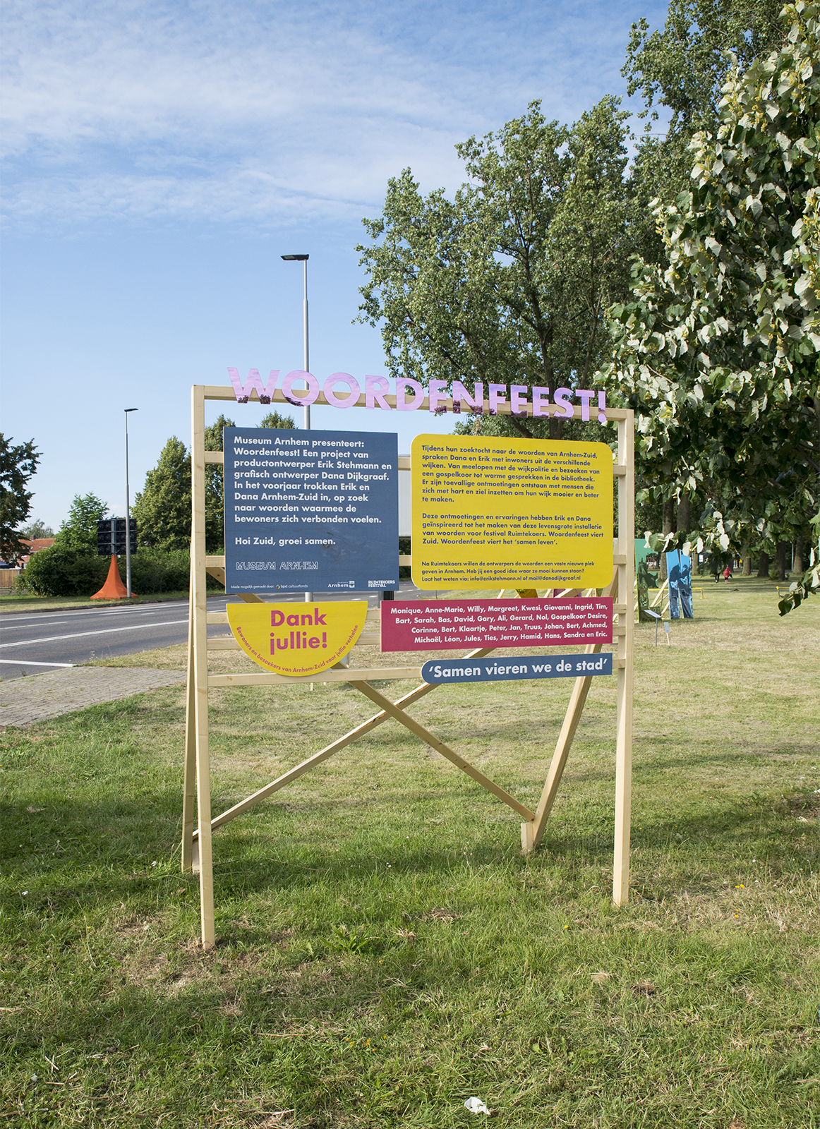
Together with the fabulous product designer Erik Stehmann, we created the project Woordenfeest (translated Word Party). We are asked to create a work that’s about connecting people in the neighbourhood of the southside of Arnhem and to present the work in a public space. In our case: a big green roadside between two big roads. For our research we spoke a lot with people on the streets, and met a lot at their work, home or during their daily activity like walking their dog or visiting the market. After our research we designed and made four big words: hoi, zuid, groei, samen (hi, south, growth, together). For us these words formed a perfect symbol for the stories we collected.
What we made
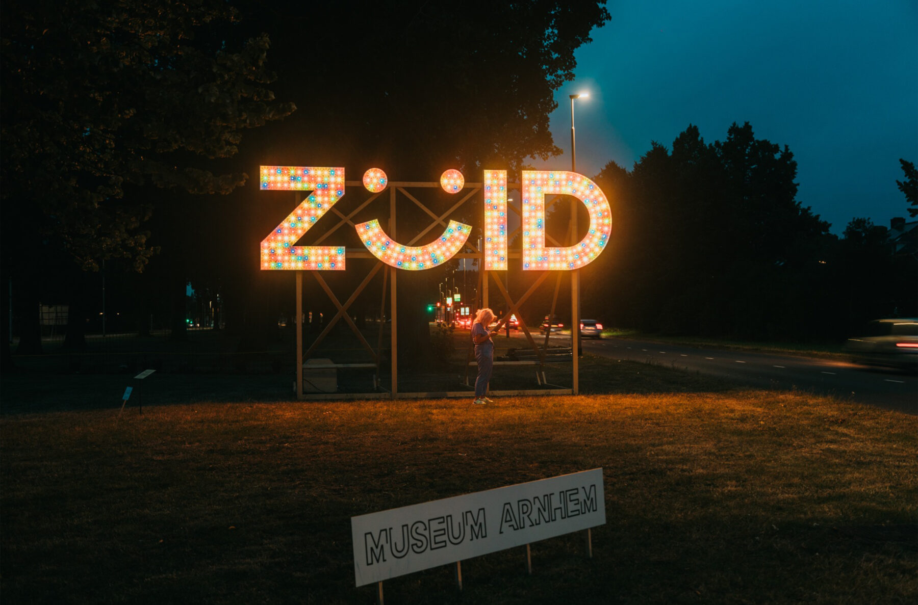
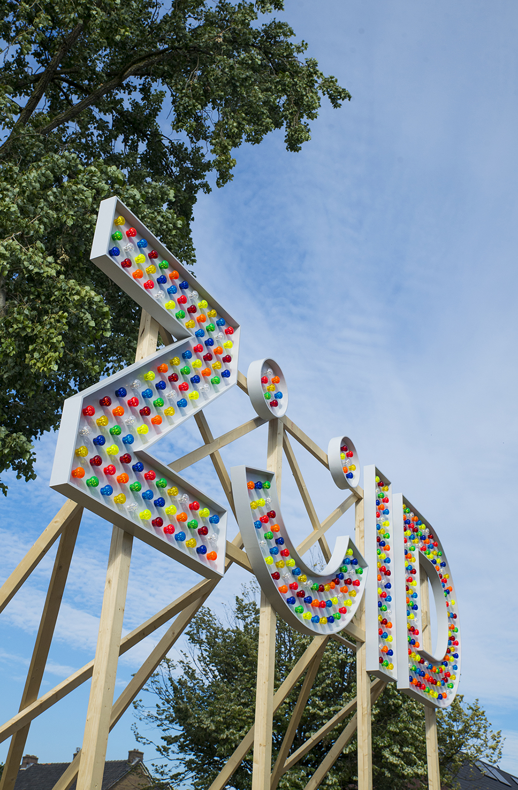
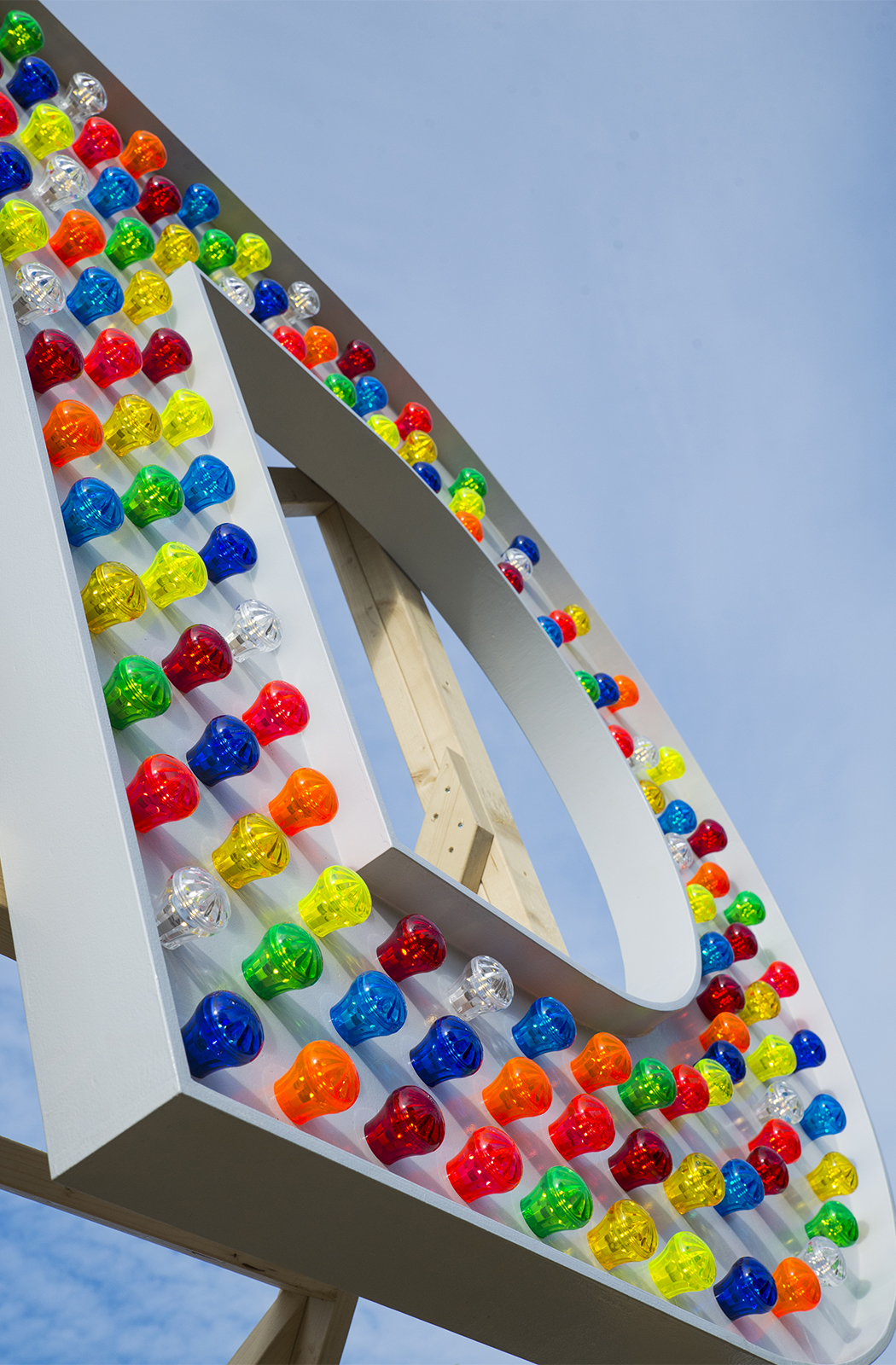
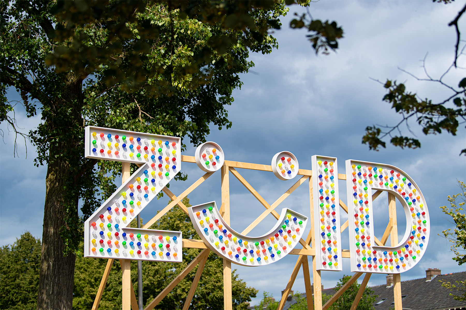
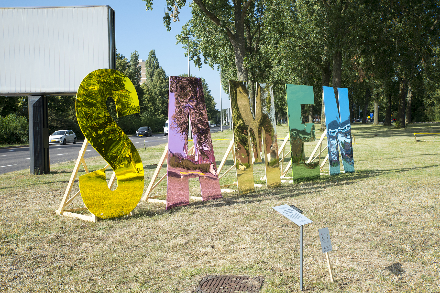
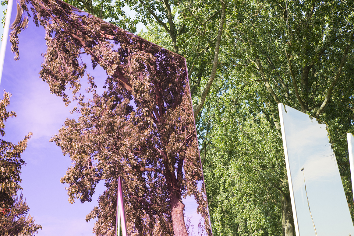
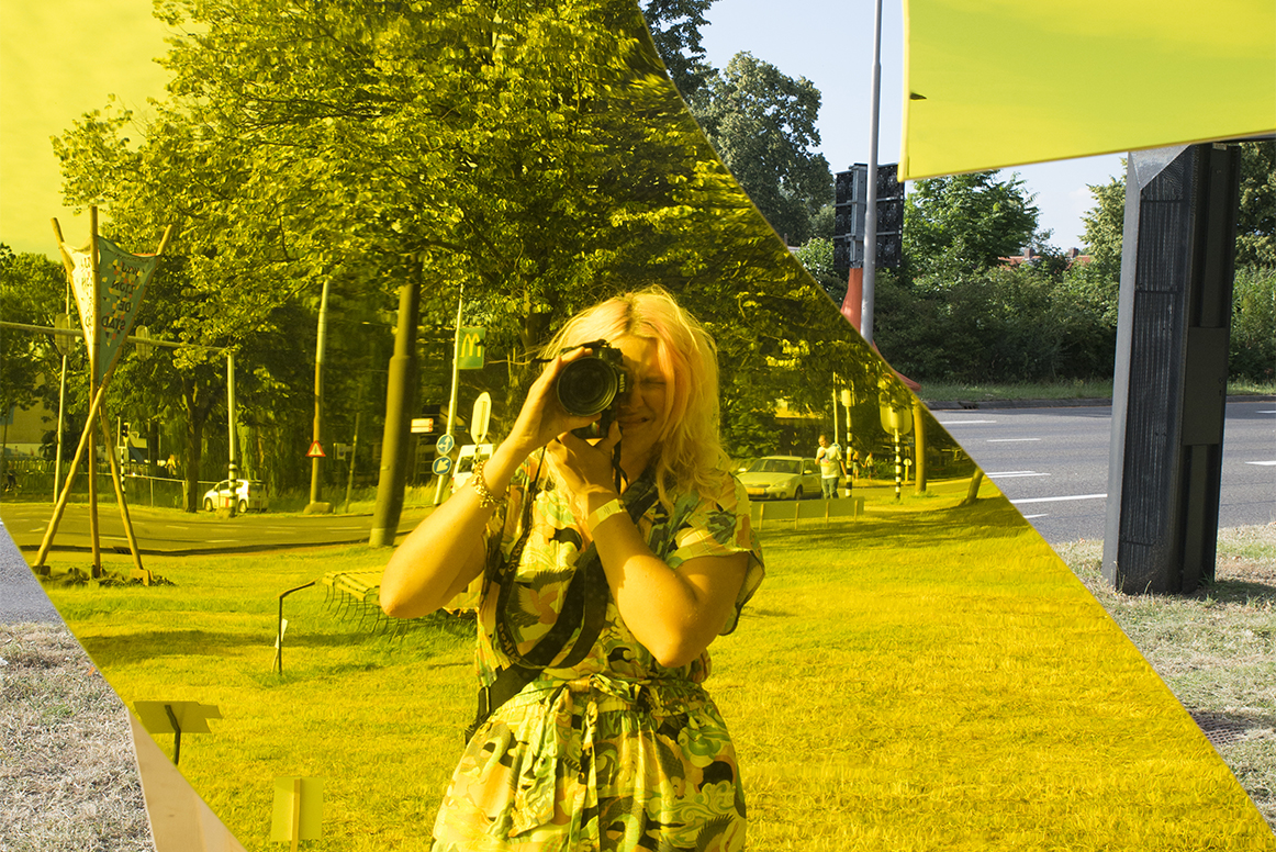
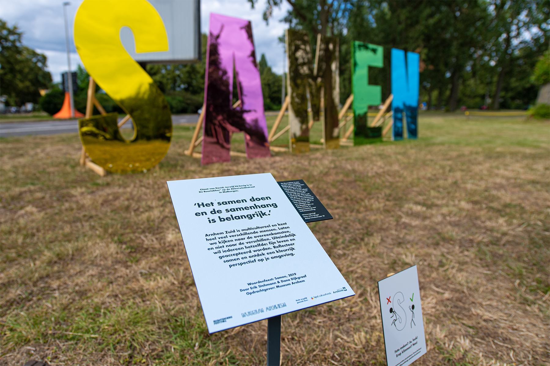
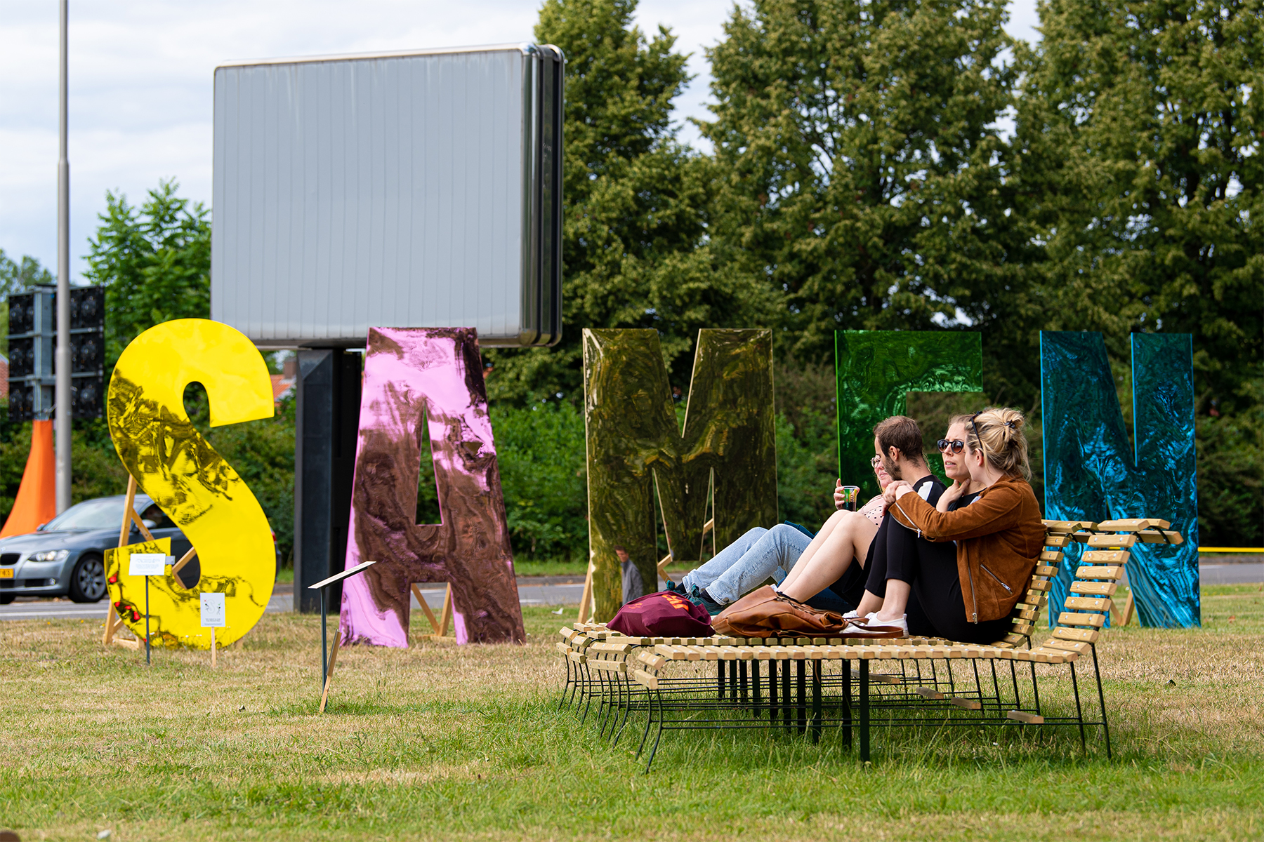
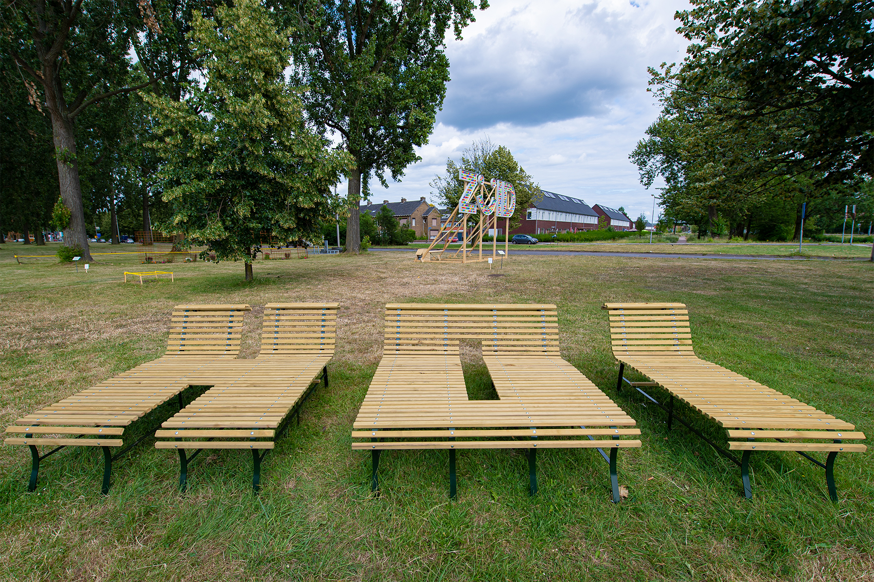
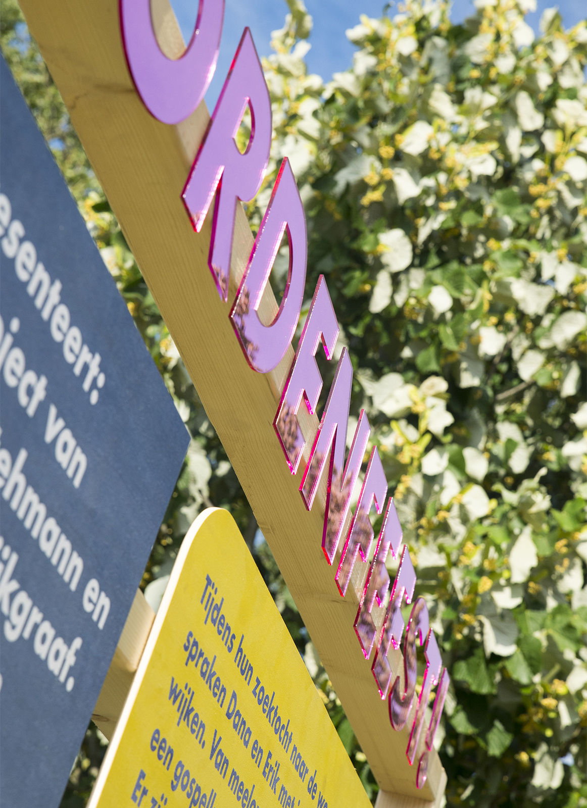
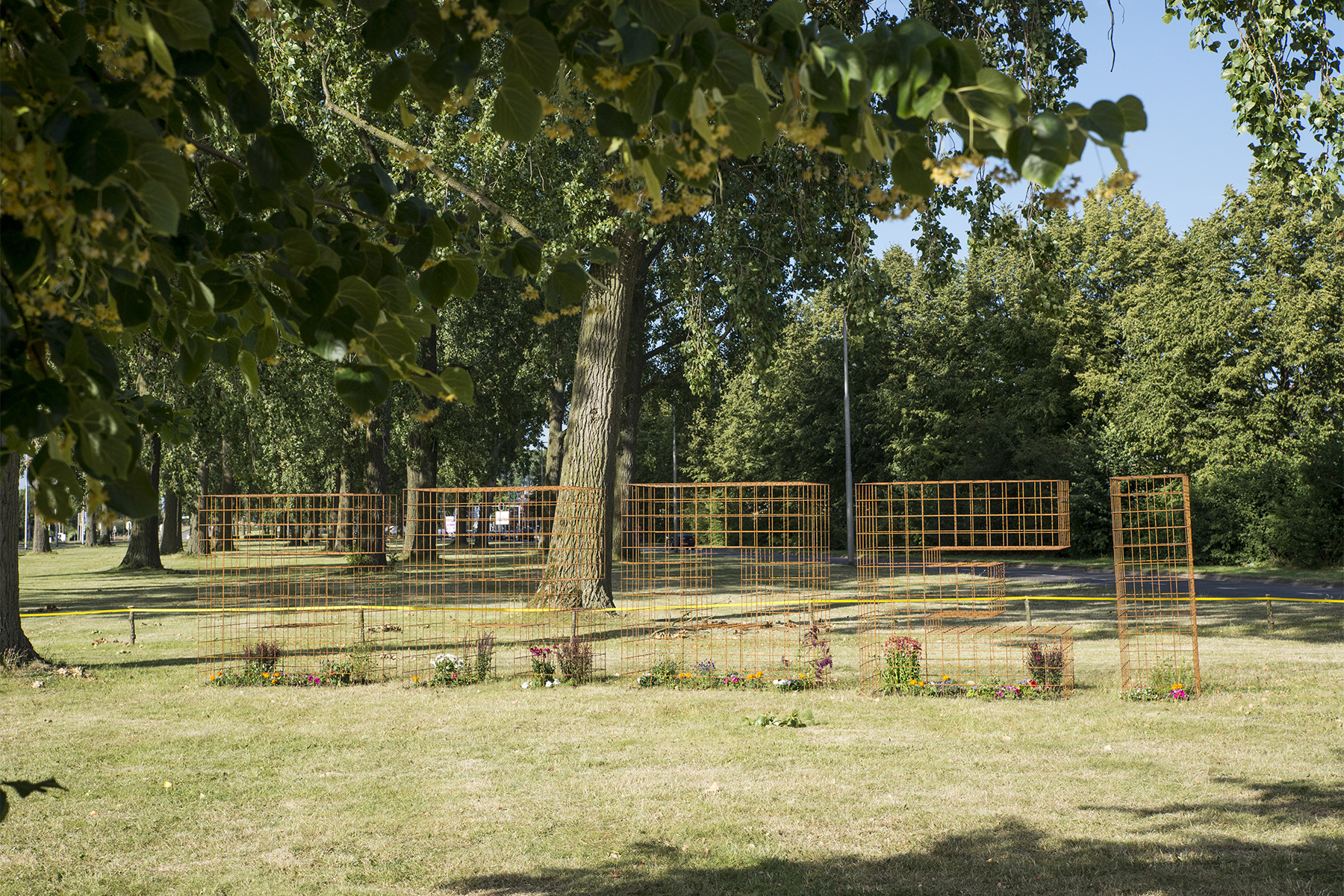
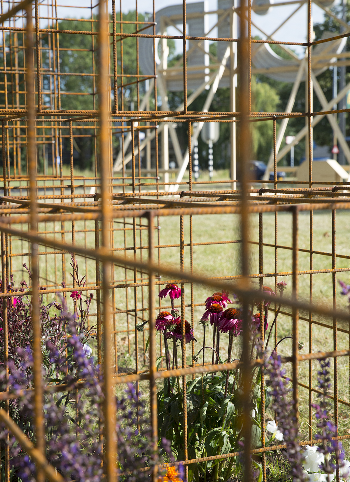
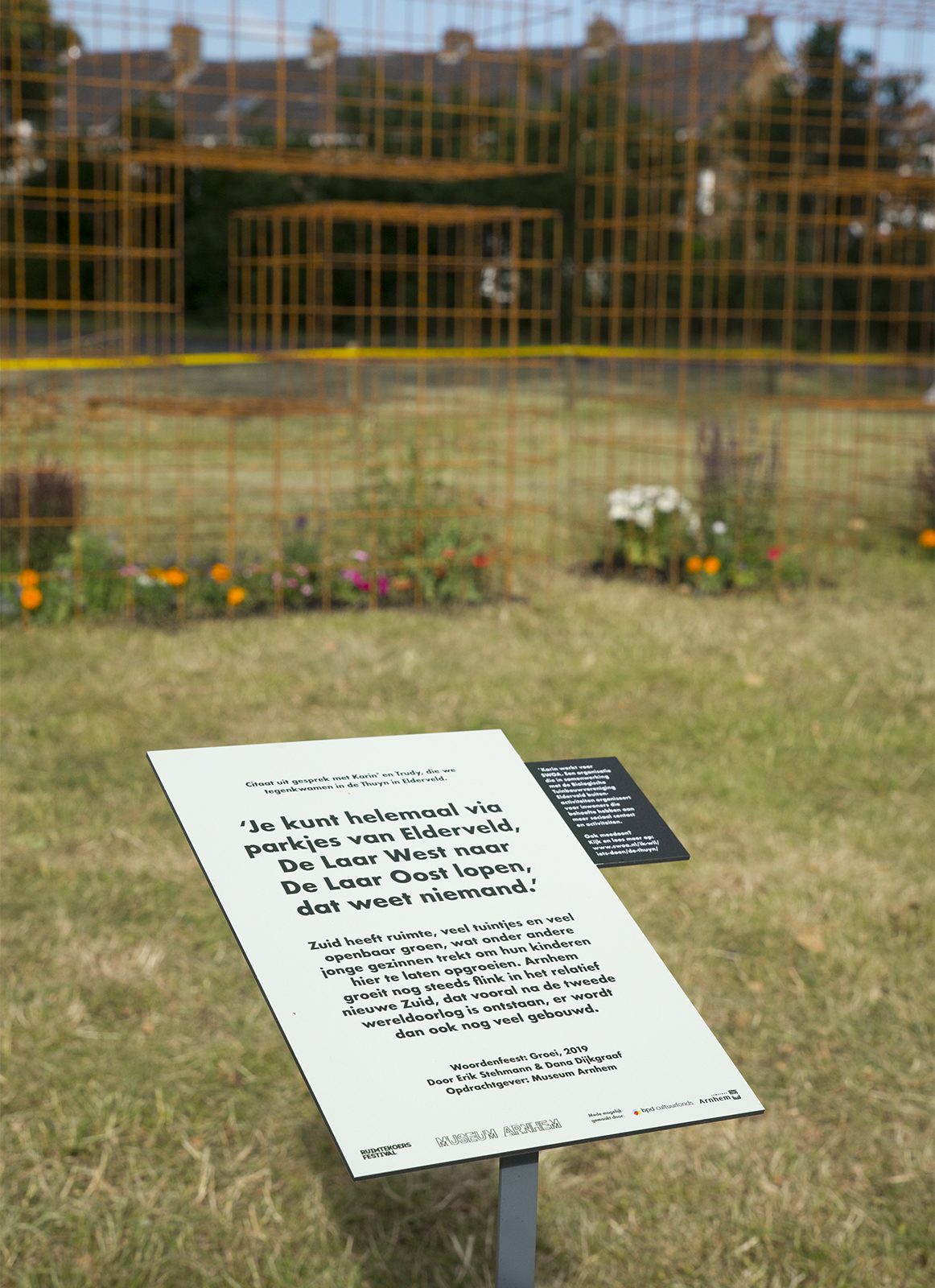
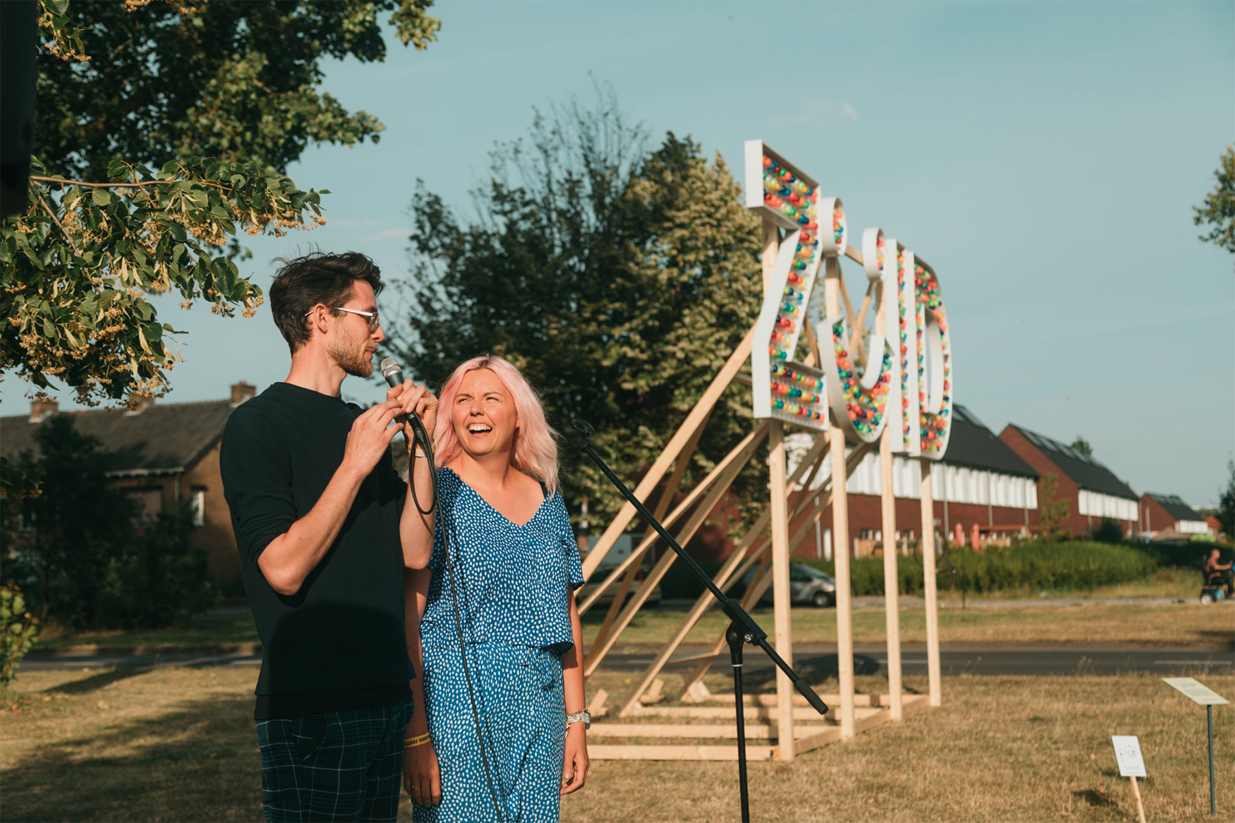
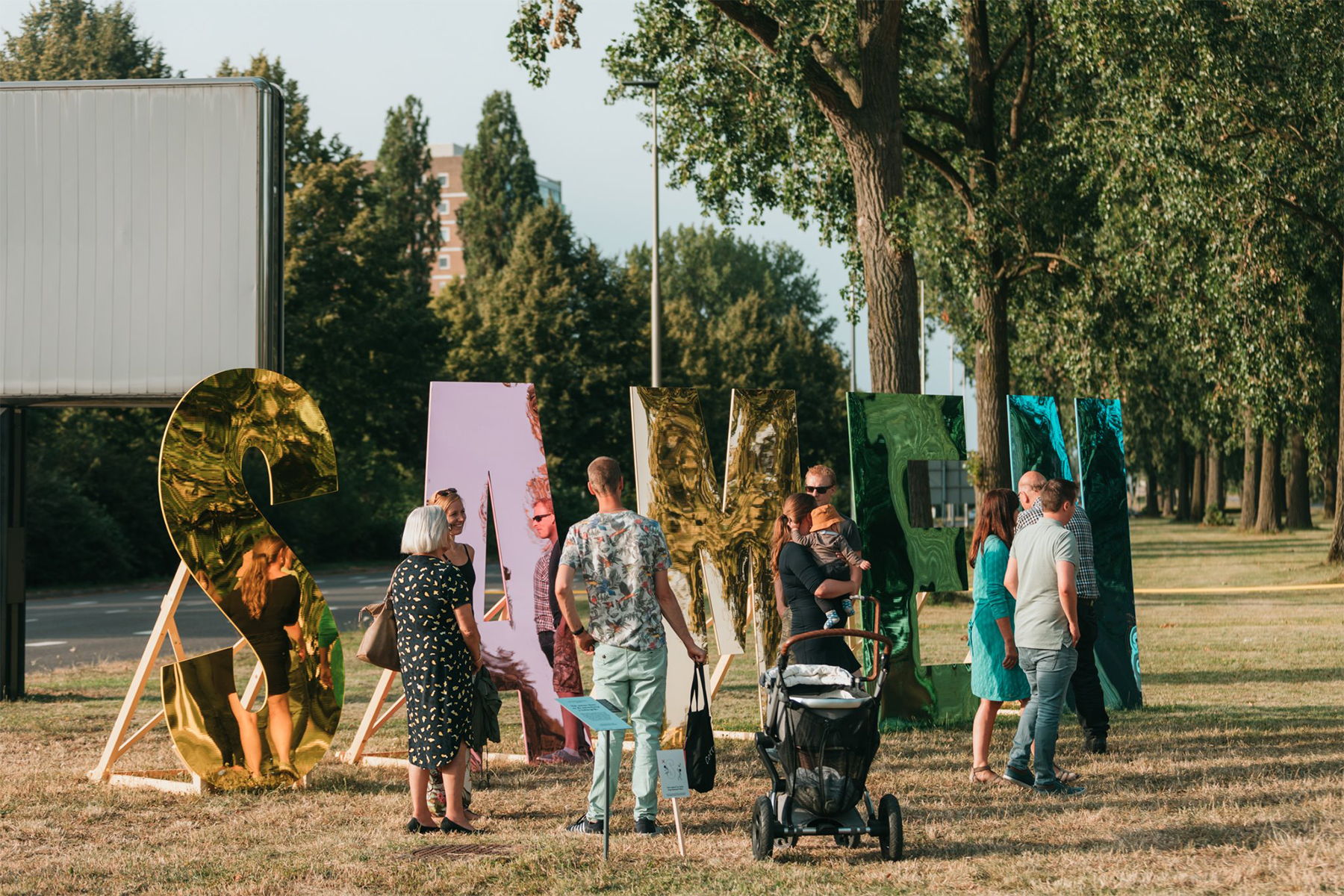
Each word is made in a form and material that fits the story. The word Hi is made in the form of benches – one of the things we heard many times, is that strangers say hi to each other on the streets. The benches for us is a symbool for this openminded attitude. The word ‘Groei’ (growth) is about the many young families that move to this part of the city and the many new houses that are build. We used a structure for the typoraphy on which plants can grow and which refer to building construction elements. The word South is created with a bunch of happy lights and a smile in its design, this refers to the many happy stories we heard about the South of Arnhem. The word Samen (together) is about all the different people and cultures that are living in this part of the city in harmony. We created huge colored mirroring letters, in which this feeling of togetherness is represented and in which you can take a look at yourself in your own reflection. Which works a bit like a funny distorting mirror where you can play around with your friends.
Sparkles
A lot of people enjoyed being around the artworks during the festival. It was a nice place for selfies and to chill with friends. The word Zuid formed a nice welcome sign for the traffic passing by and it gave the public space a magical touch in the dark.


