Another Month, Another Paper
Concept
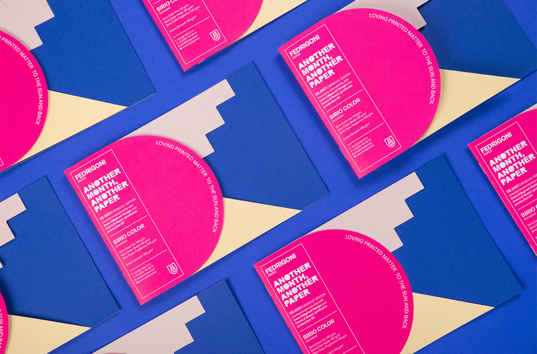
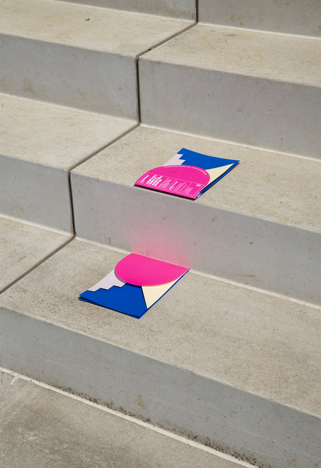
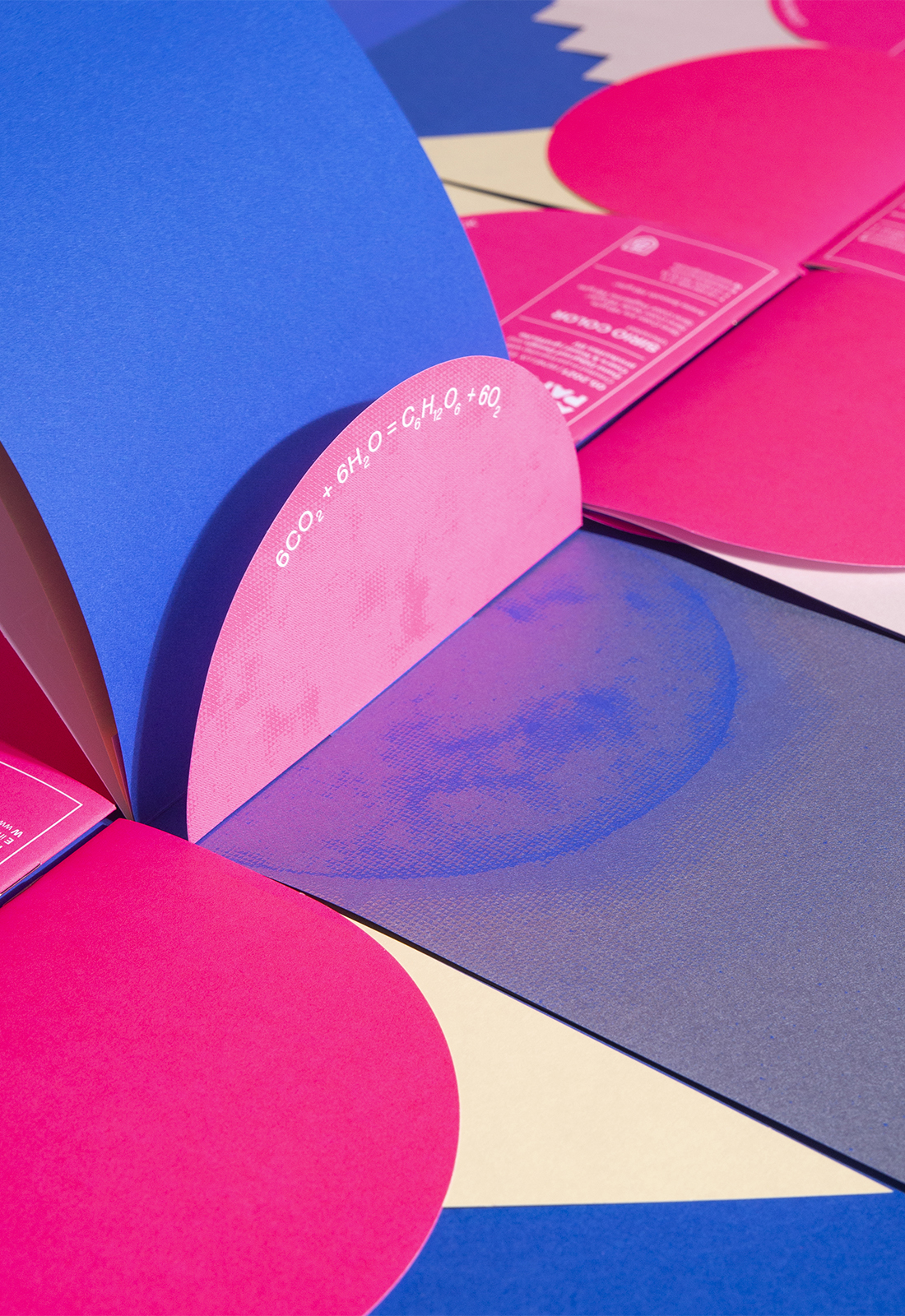
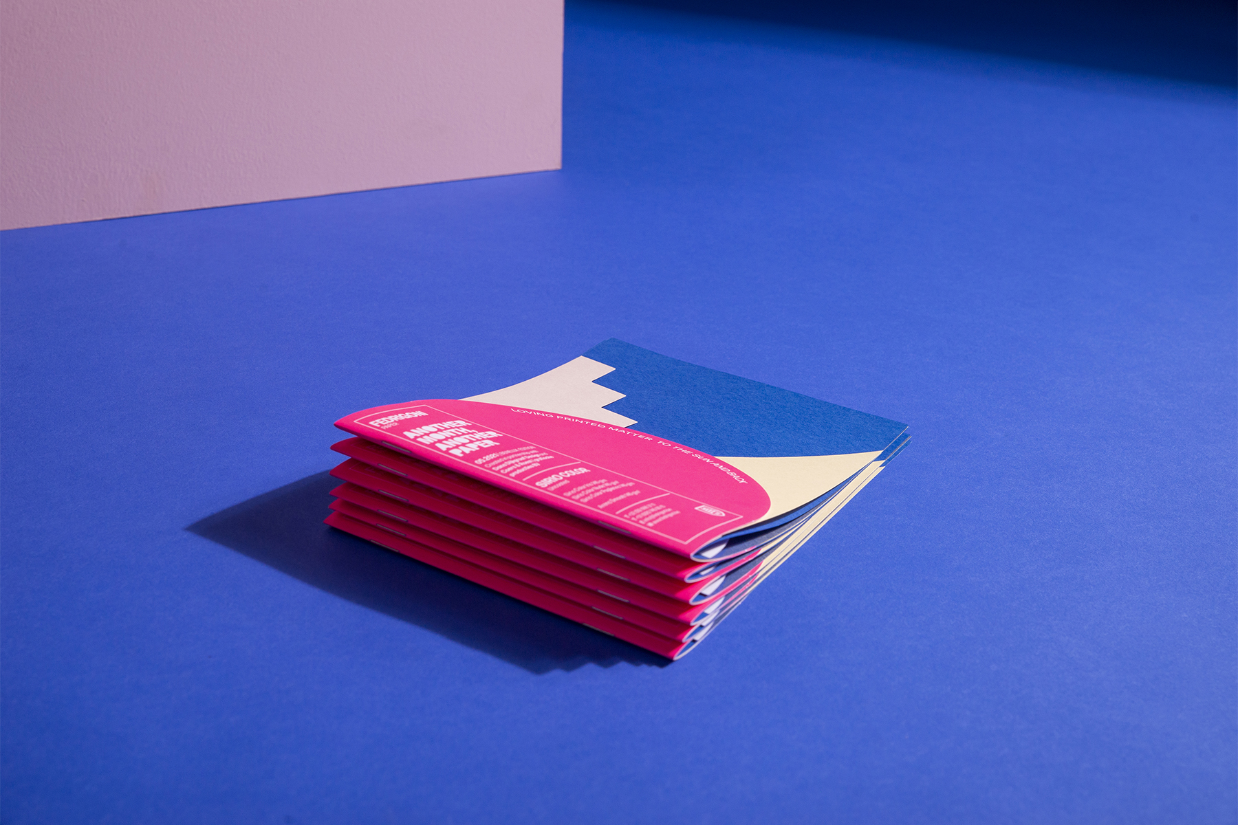
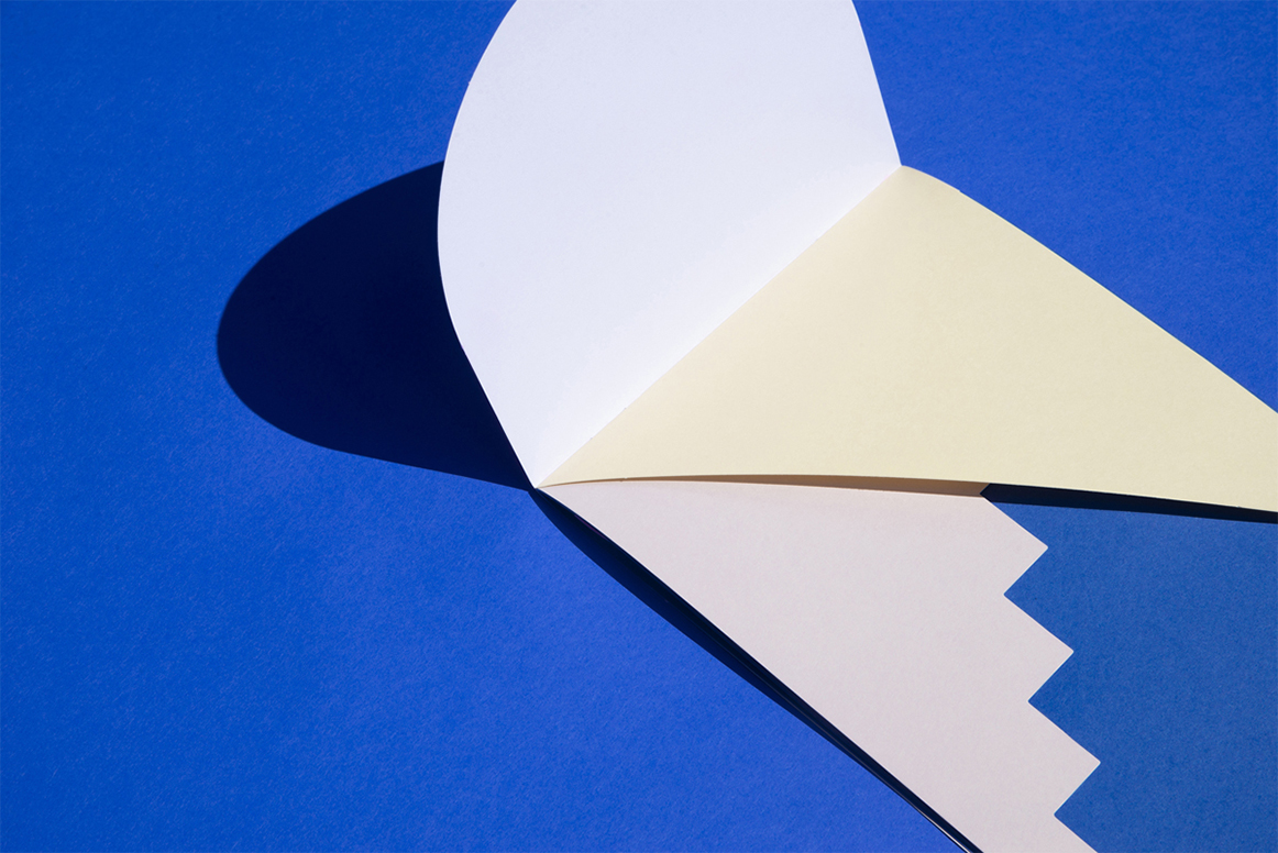
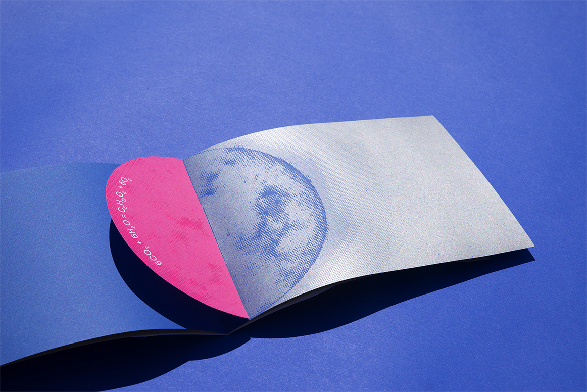
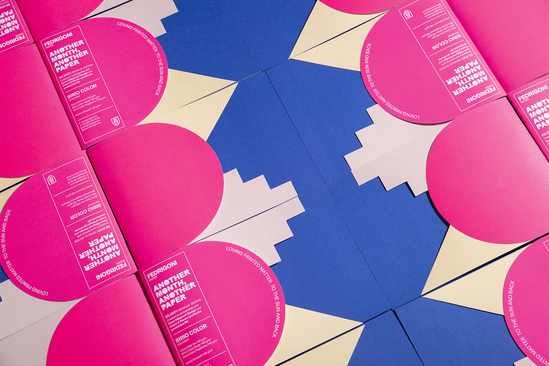
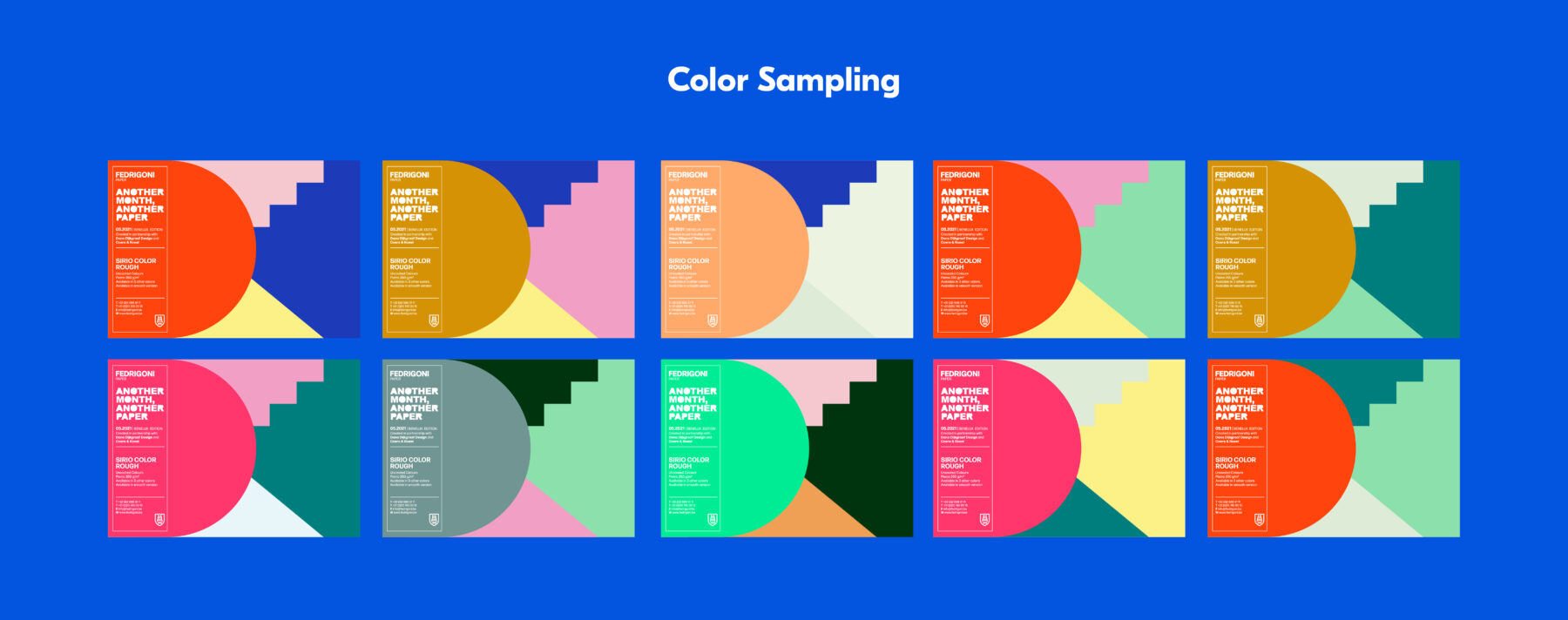
The AMAP series of A5 cards initiated by Fedrigoni is a means to showcase different papers and is created to inspire designers and makers. For each card, they invite different printers and designers. Next to the size, there is one restriction: the card should have the column of information with paper specifications. When I started the project, I thought it would be nice to show different papers. It is all about showcasing and inspiring, so why not show more than one paper? For the design I created an abstract depicition of the sun and stairs. In the card, you find a graphical image with the scientific formula of photo syntheses (the chemical proces that takes place in a plant). The photo is set in bitmap, this kind of structure fits the shapes of the card perfectly. The front of the card says: Loving paper to the sun and back. The colorful card is an ode to the sun, because we will always need it to make paper.
What we made
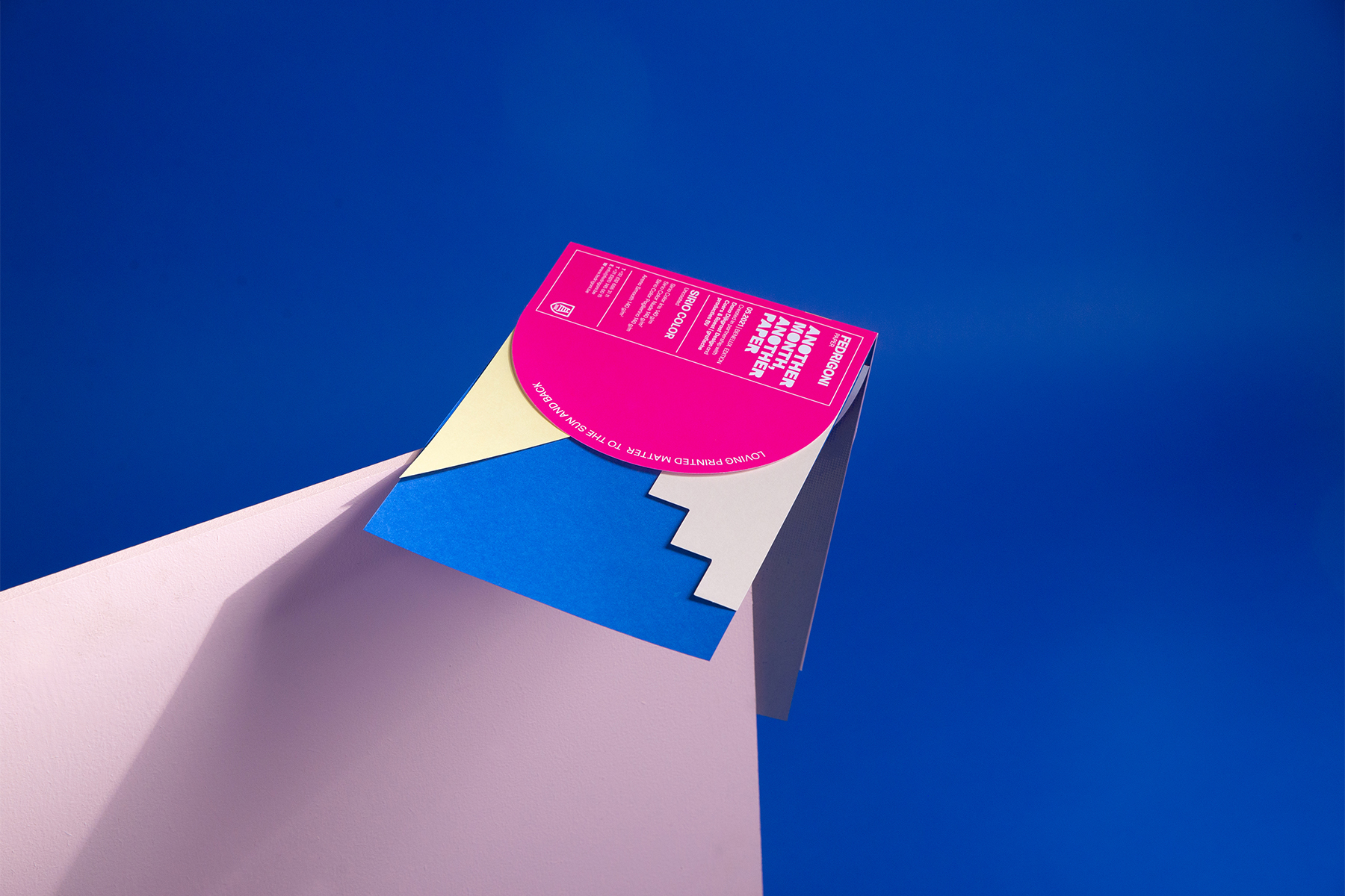
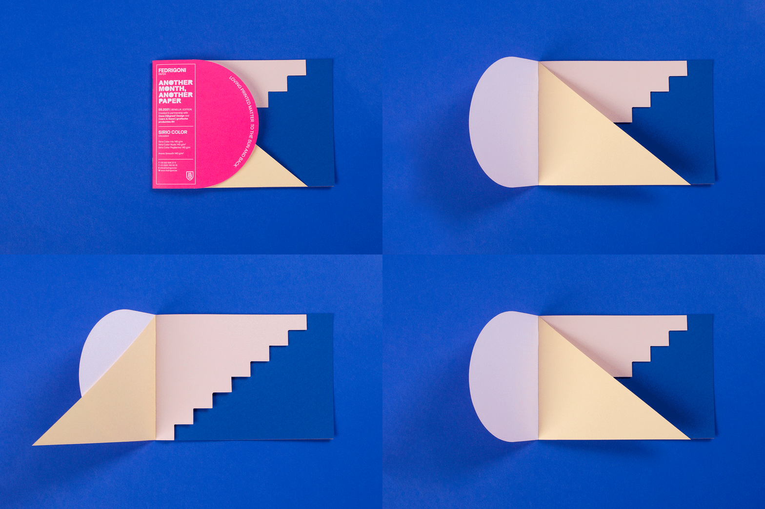
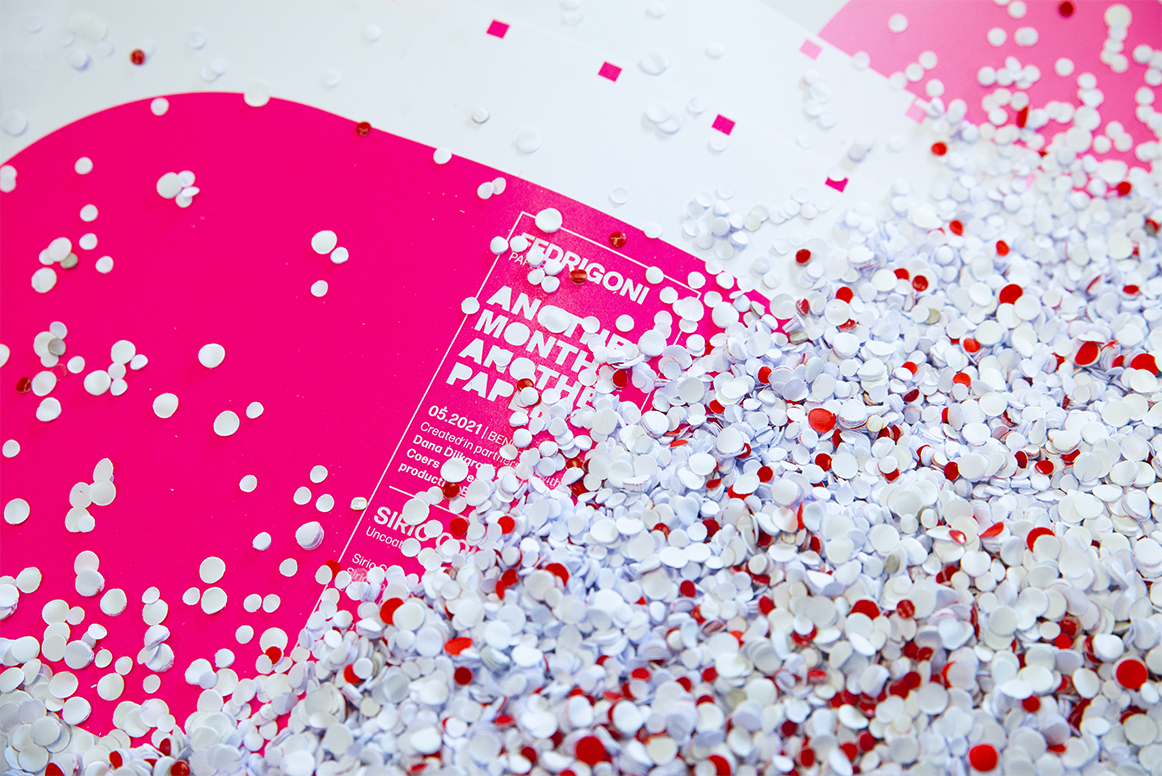
We made a card with different layers of paper and a pop up. The pop up is pasted into the card by hand by the enthusiastic team of Coers & Roest. We love it when an idea turns into something tangible. Especially when something ‘simple’ like a card, has become an object of itself.
Sparkles
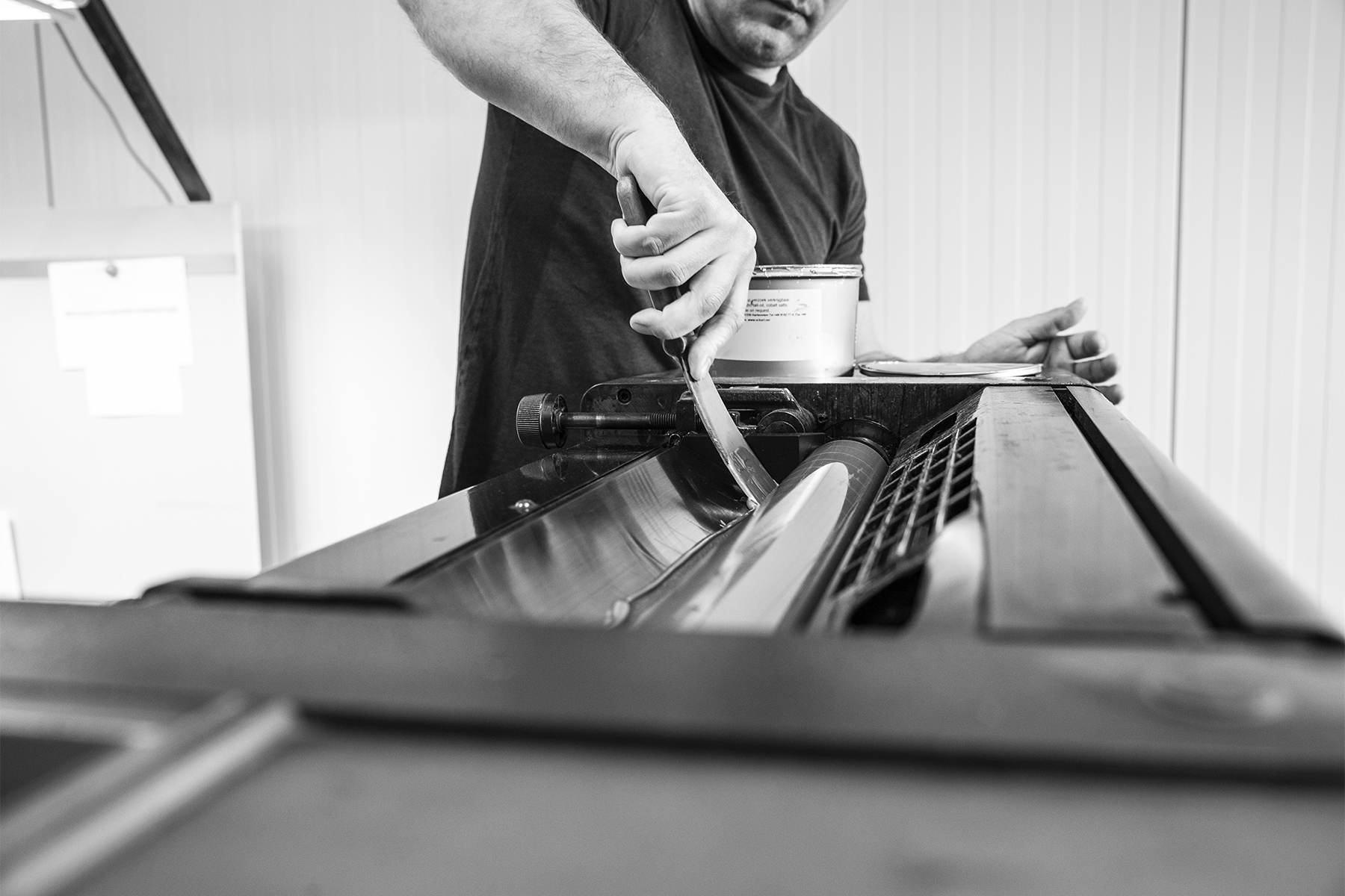
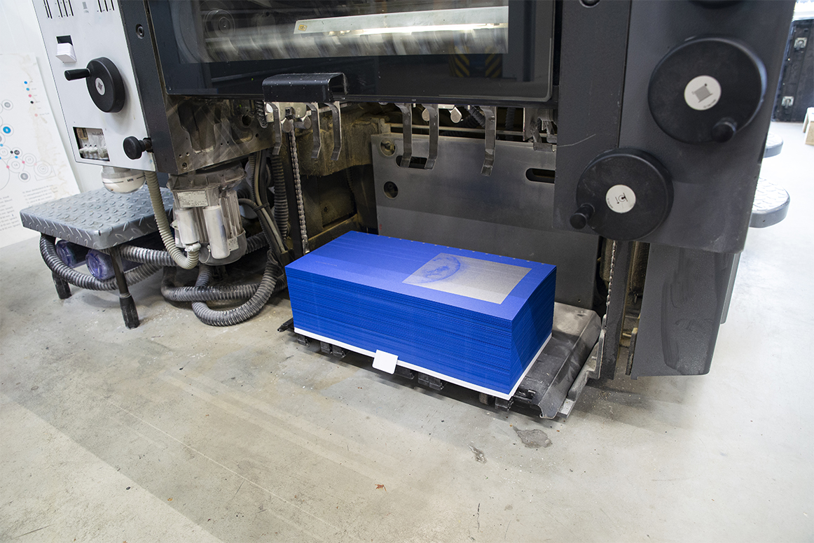
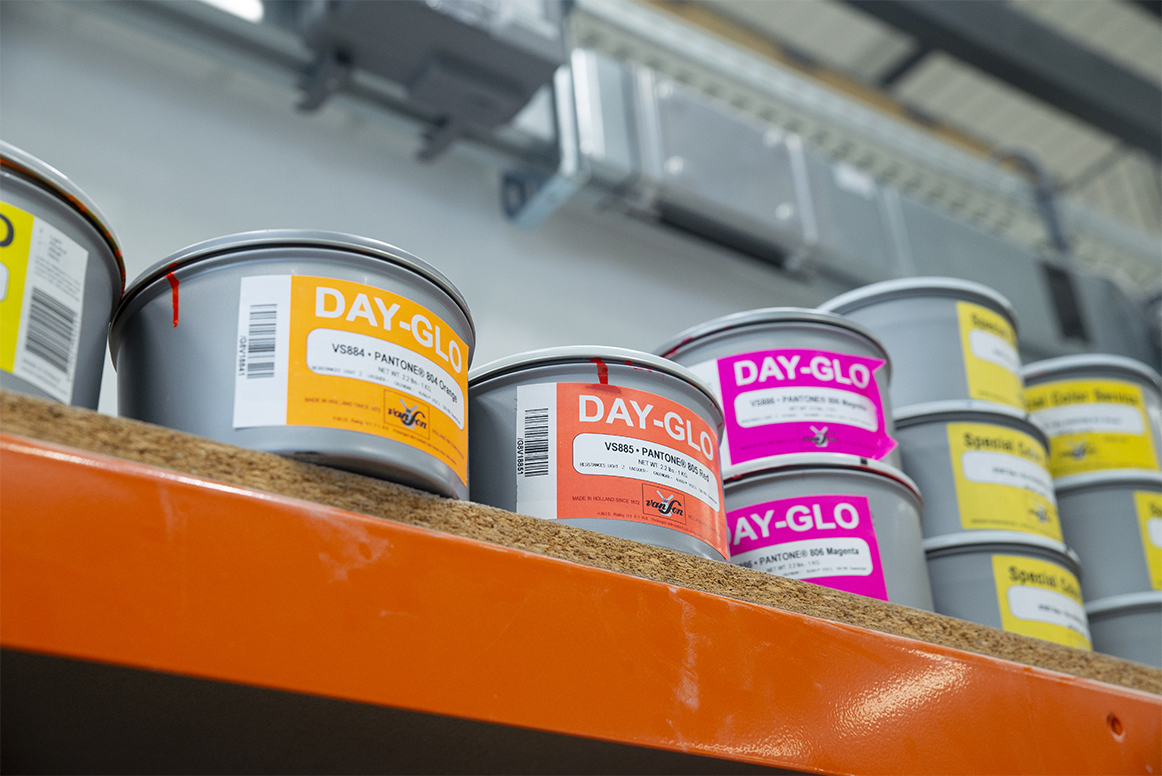
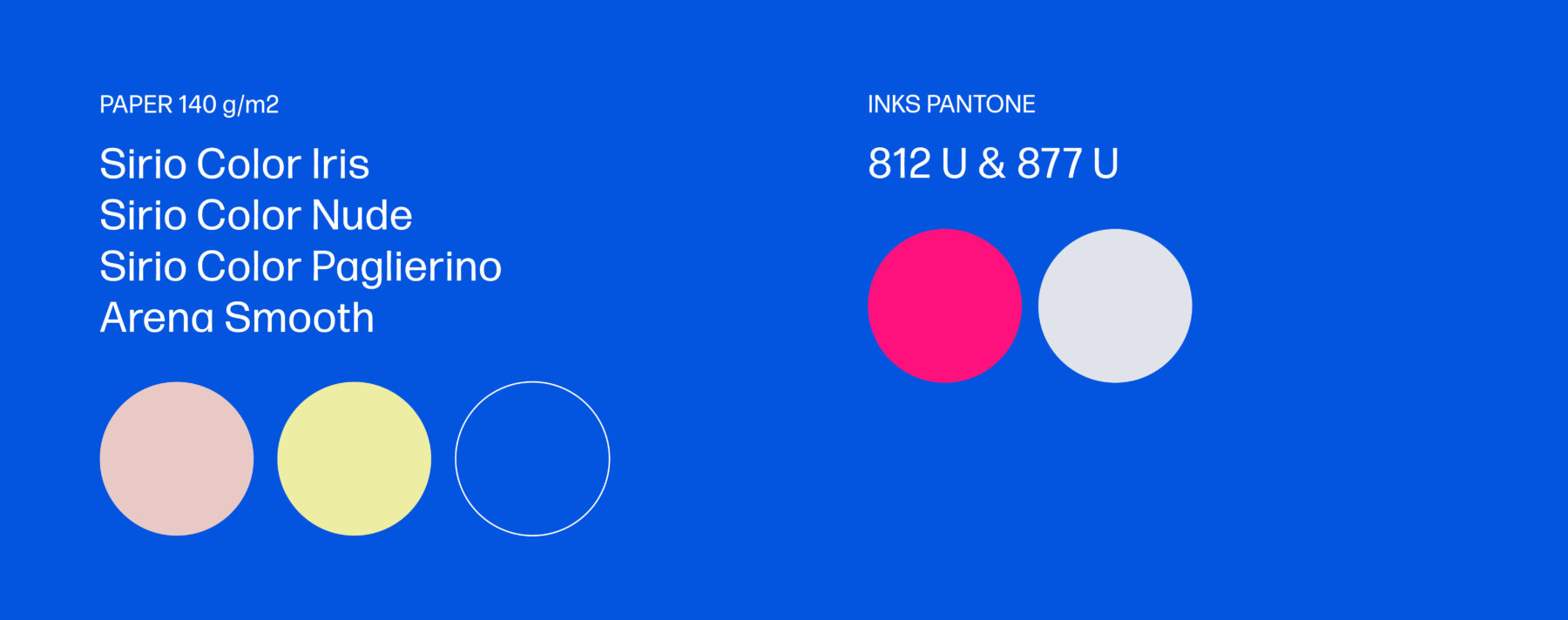
For the printing of the cards we used two pantone colors: fluor pink and silver (pantone 812 and 877). We choose these inks because they are freaking amazing, but also because the printer had them in stock as leftovers from previous projects. Beautifully sustainable!


