AetA
Concept
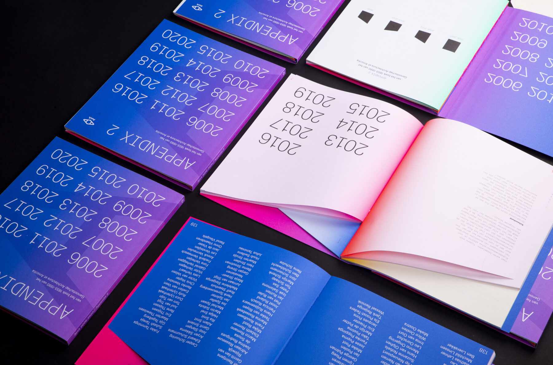
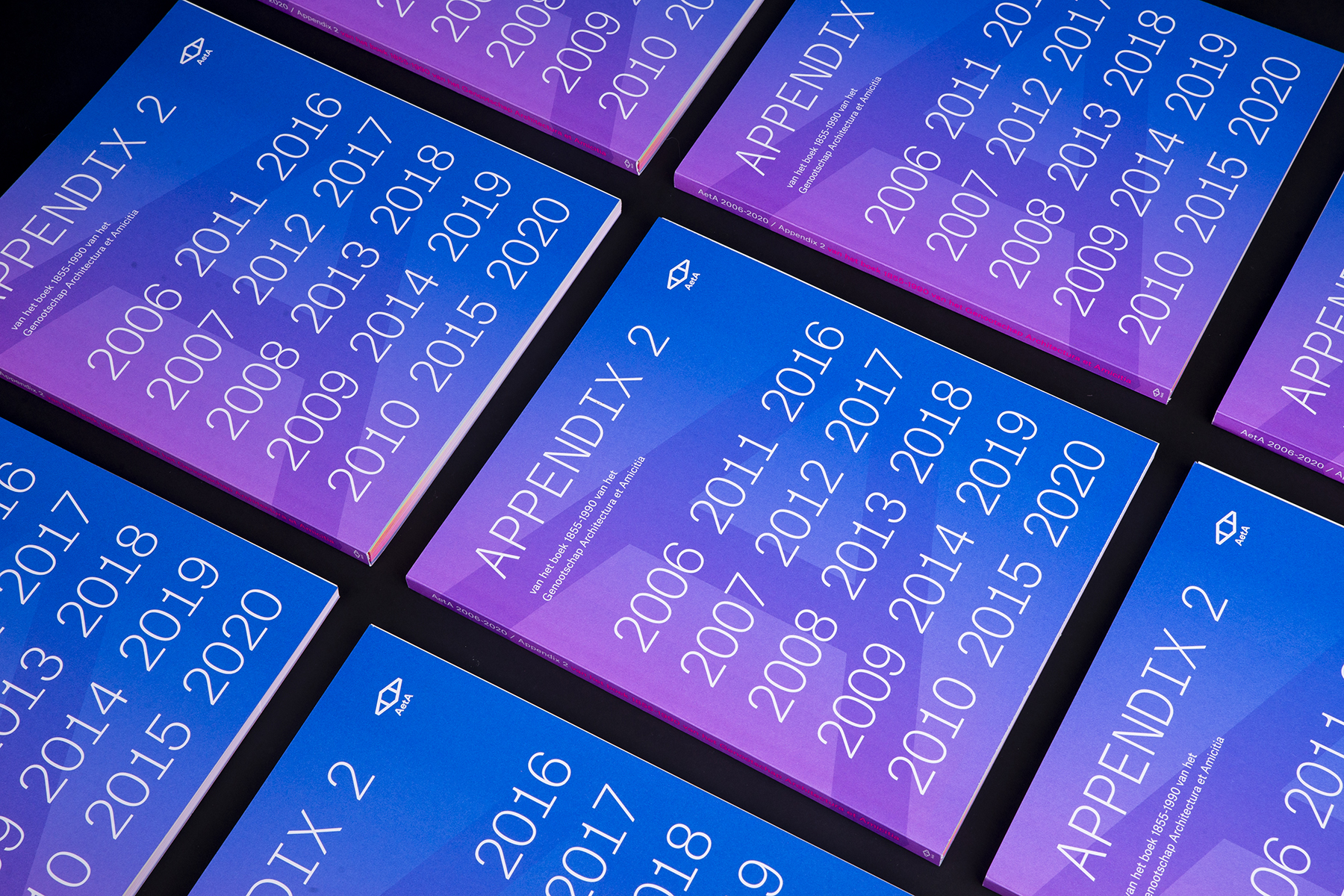
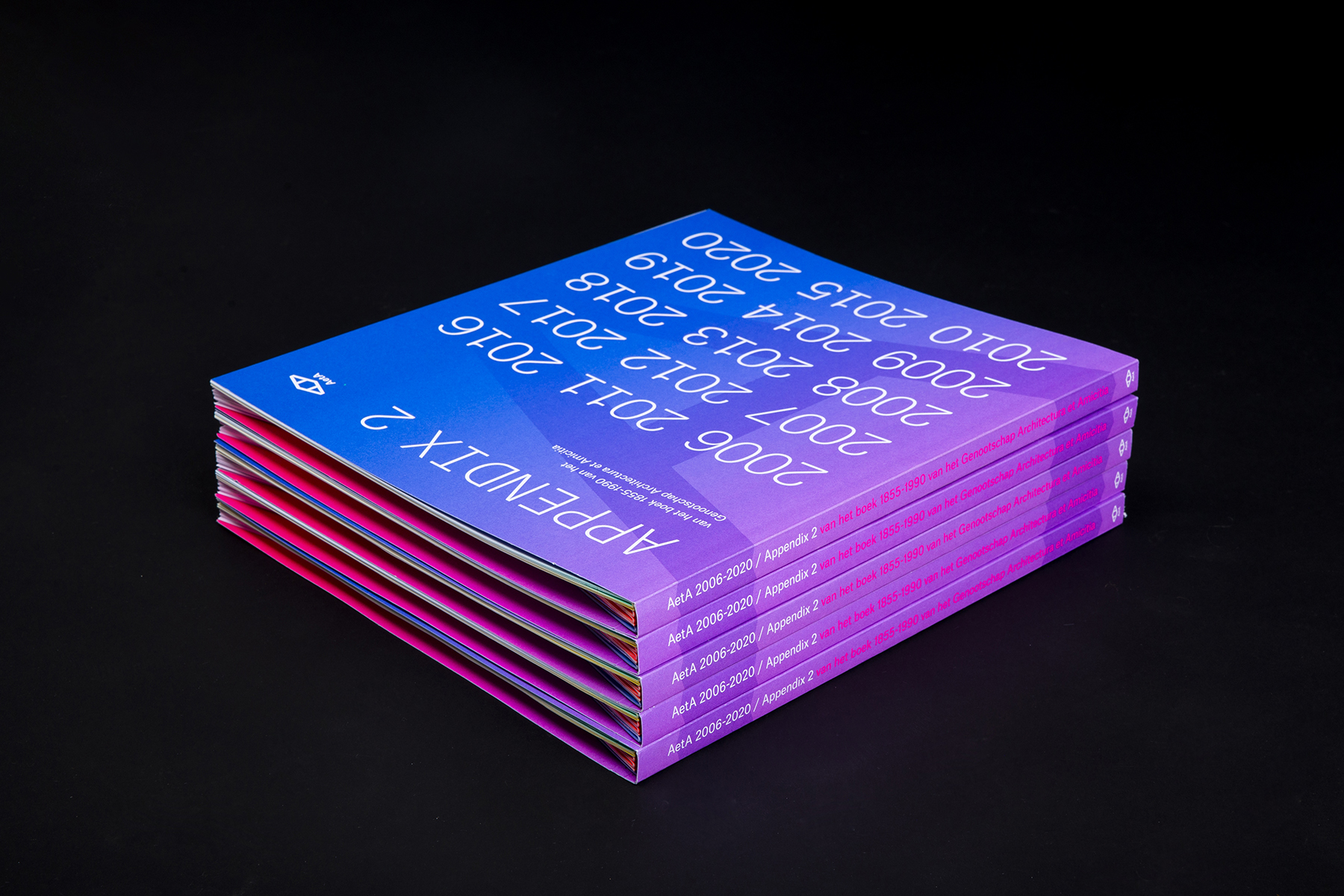
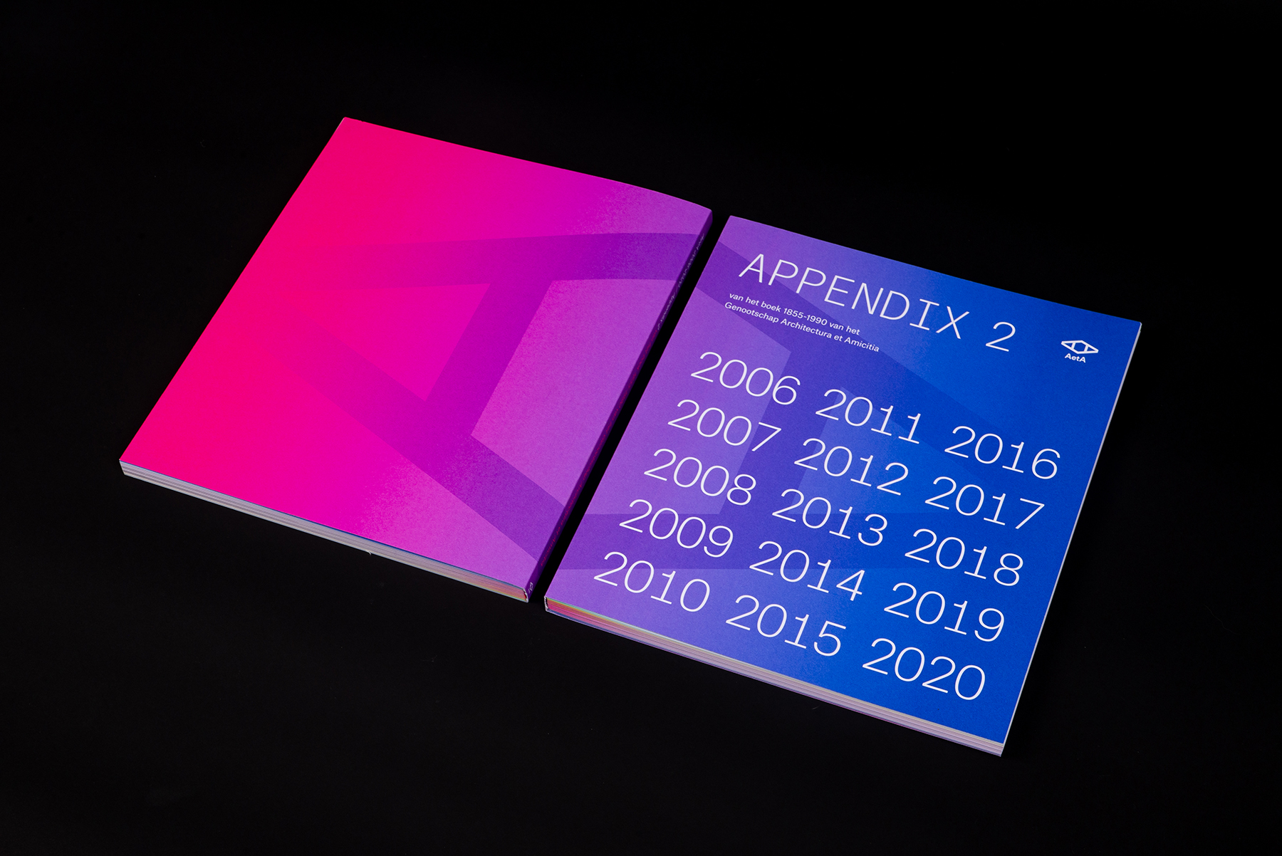
The first 135 years of its existence were recorded in the book ‘Genootschap Architectura et Amicitia 1855-1990′ (1992). The first appendix of this book appeared in 2006. In 2021 we created ‘APPENDIX 2 Genootschap Architectura et Amicitia 2006-2020’. To make it a strong series, we used the same format as the first books.
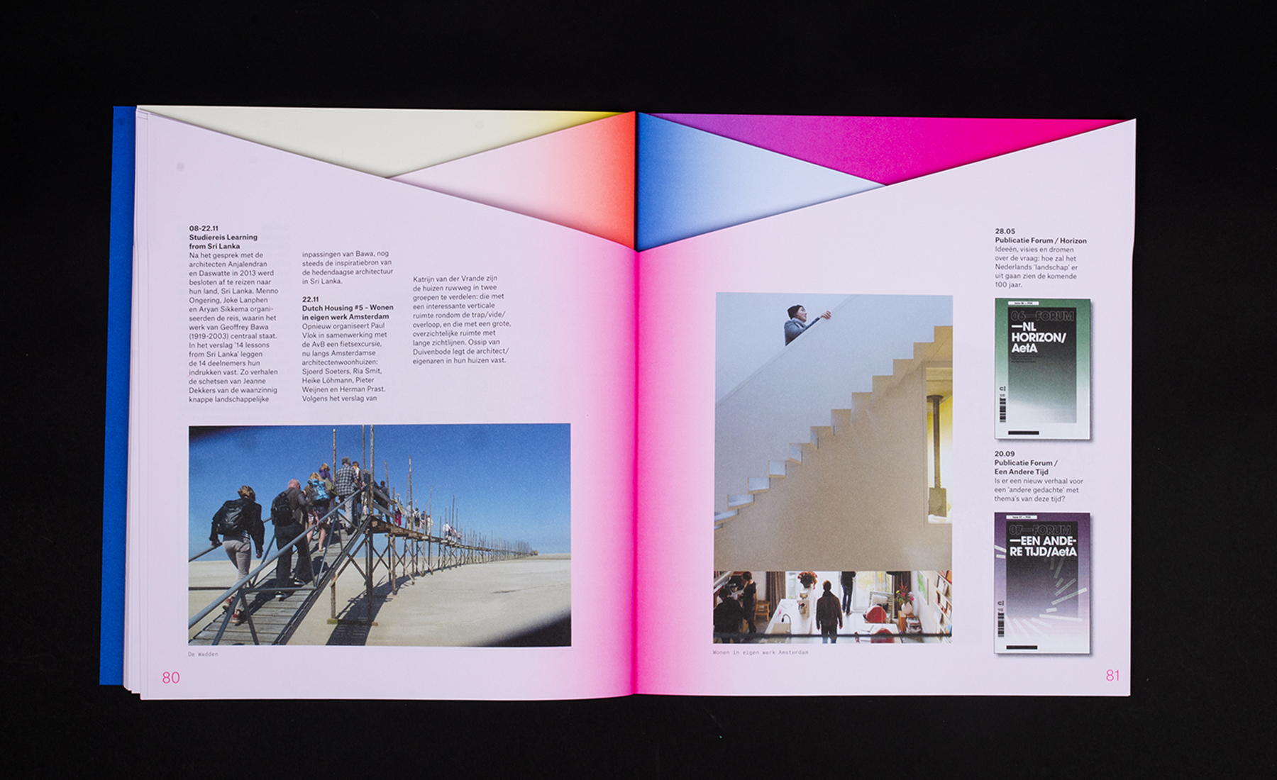
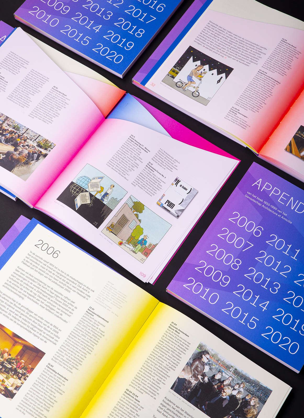
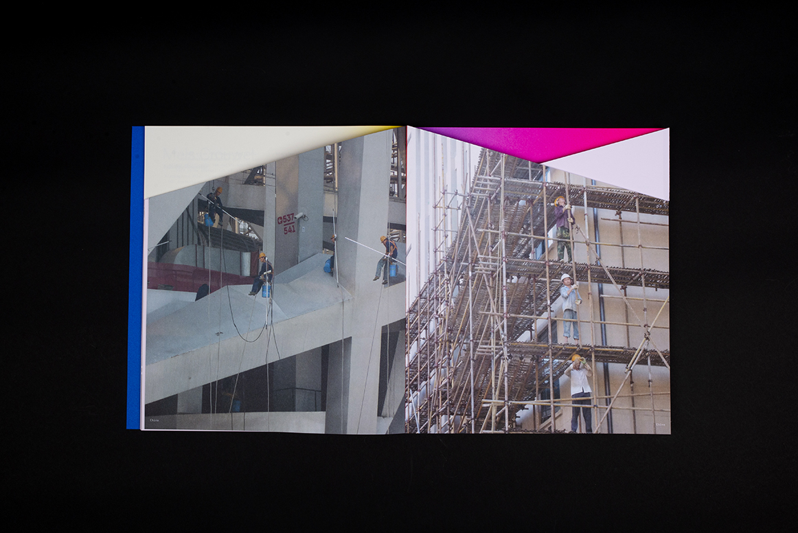
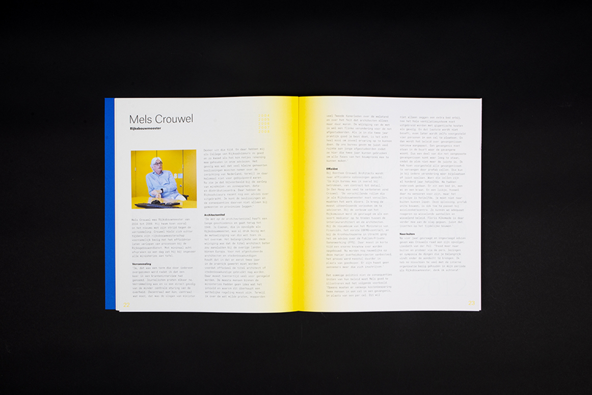
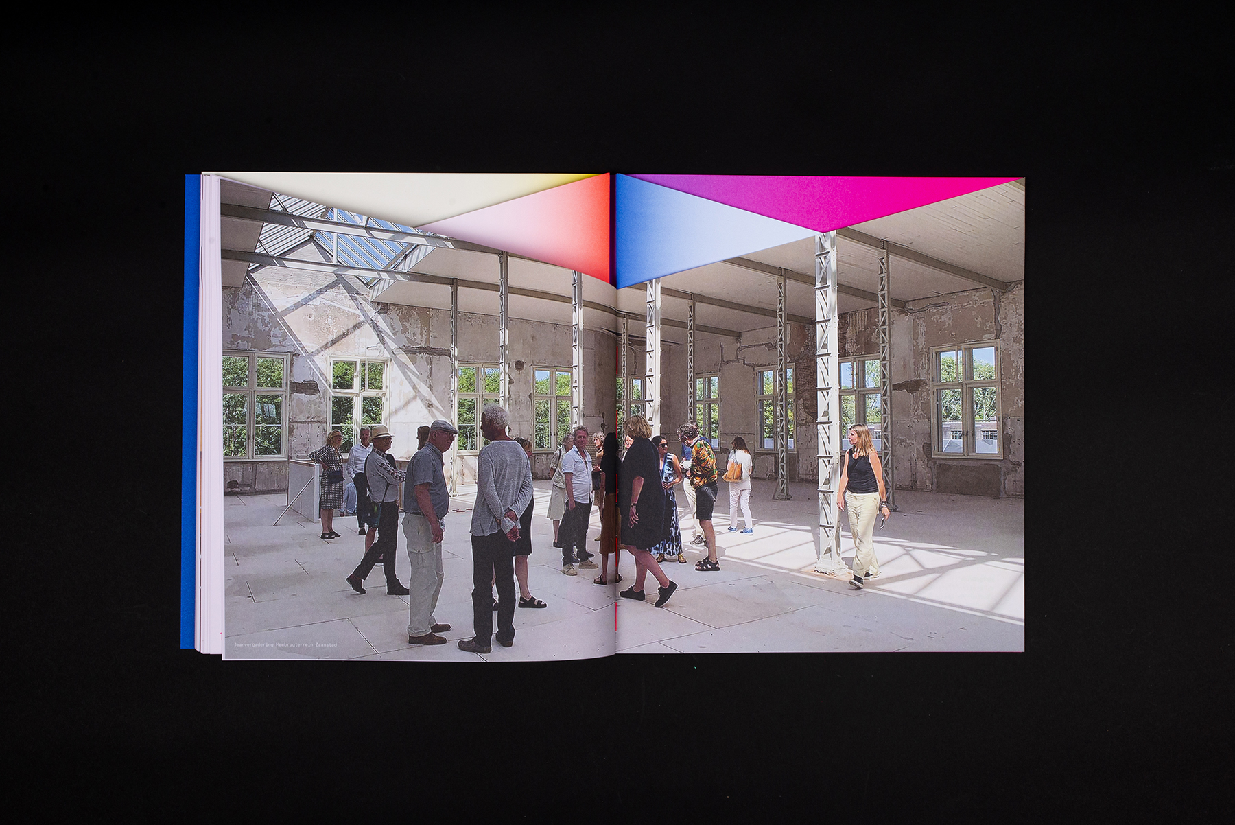
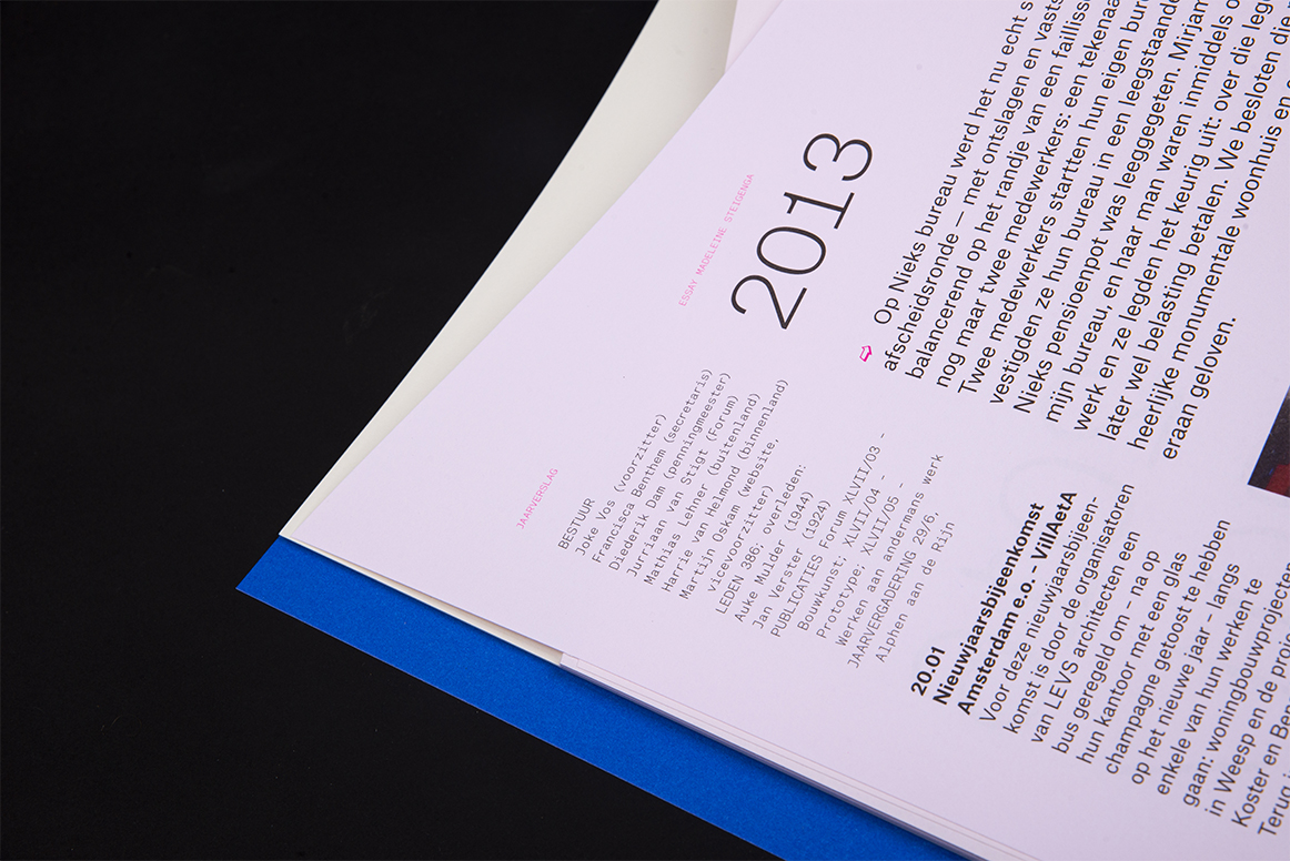
The book is a collection of: reports and photographs of association activities, portraits of board members (by illustrator Joost Swarte), covers of published work, interviews with national architects (2006-2020) and a personal essay written by architect Madeleine Steigenga. The personal essay runs through the book like a thread.
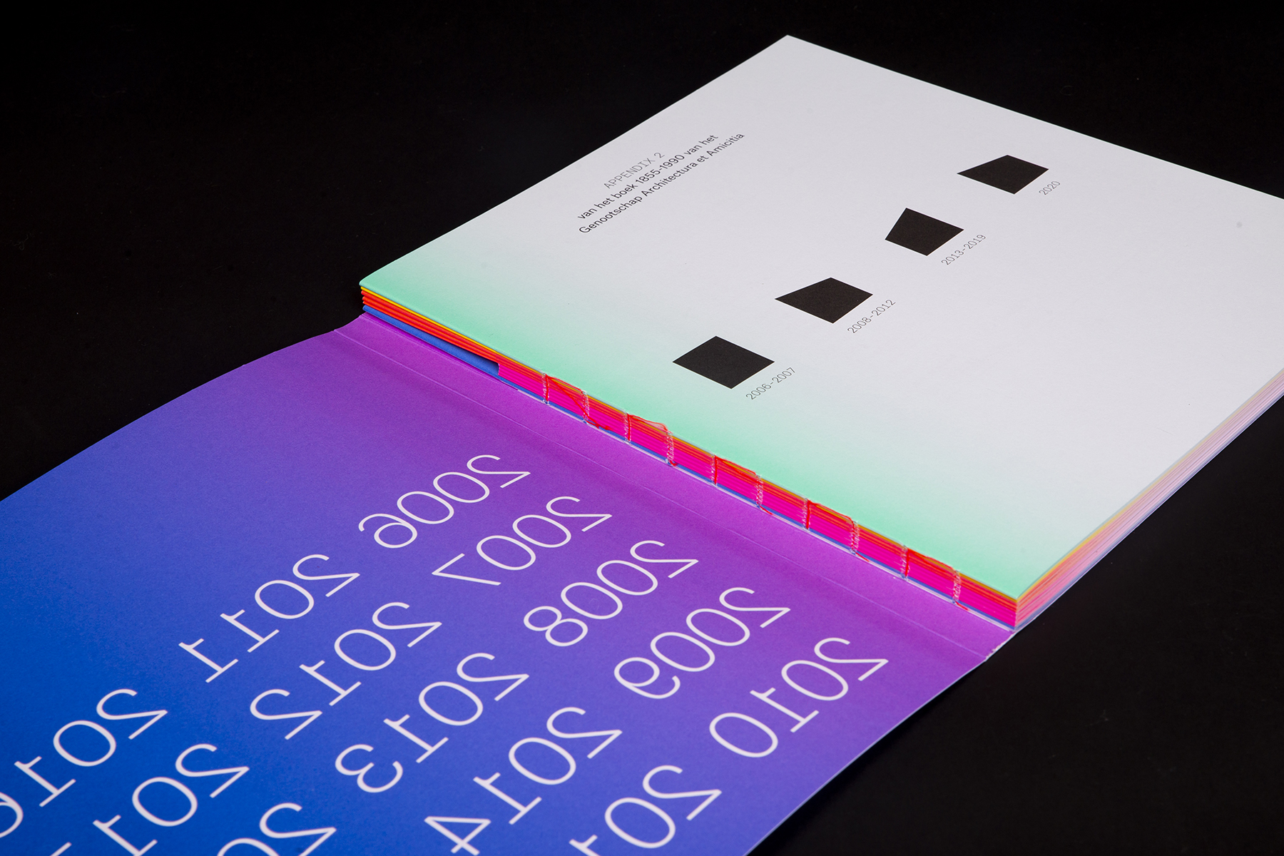
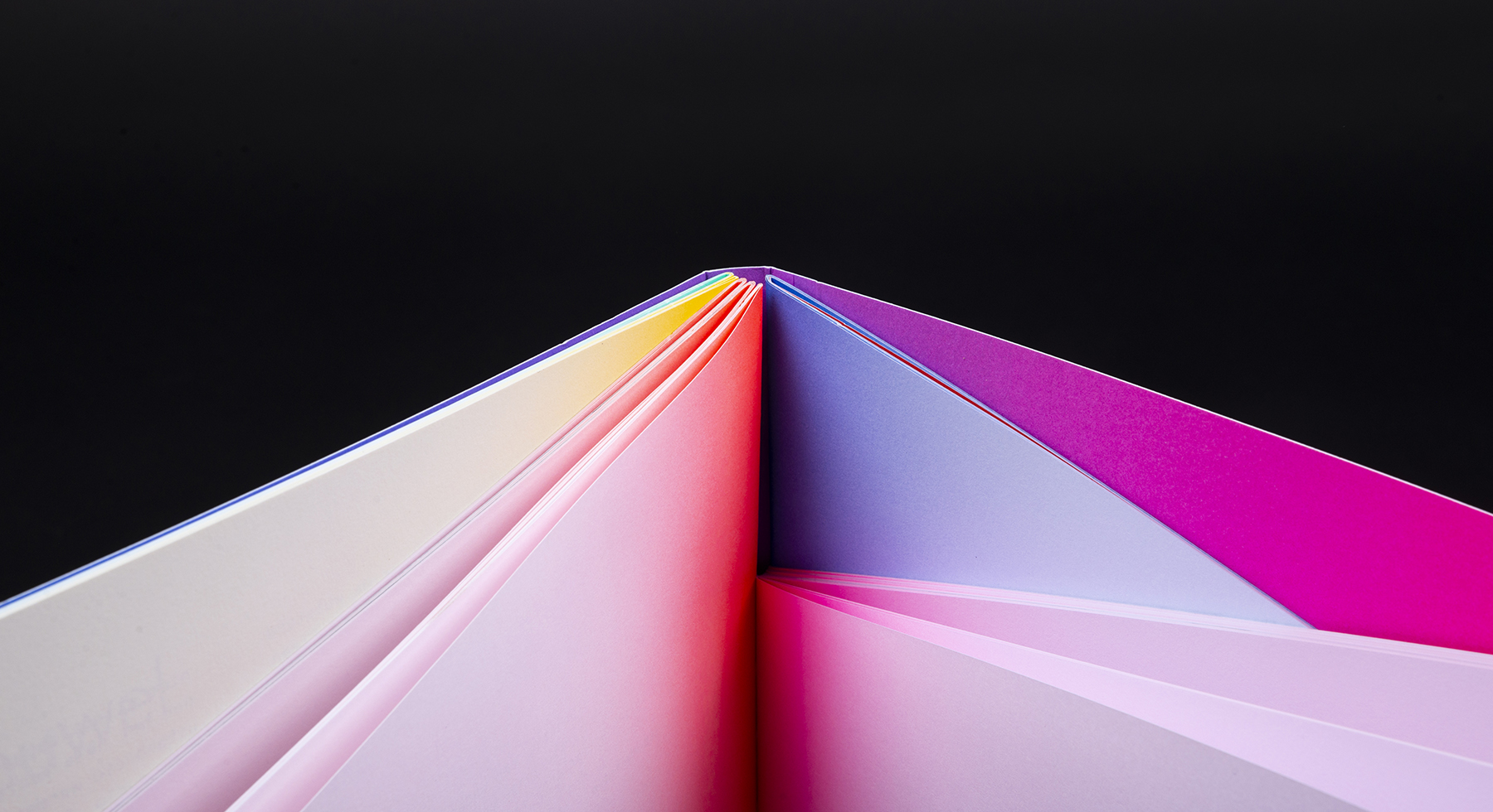
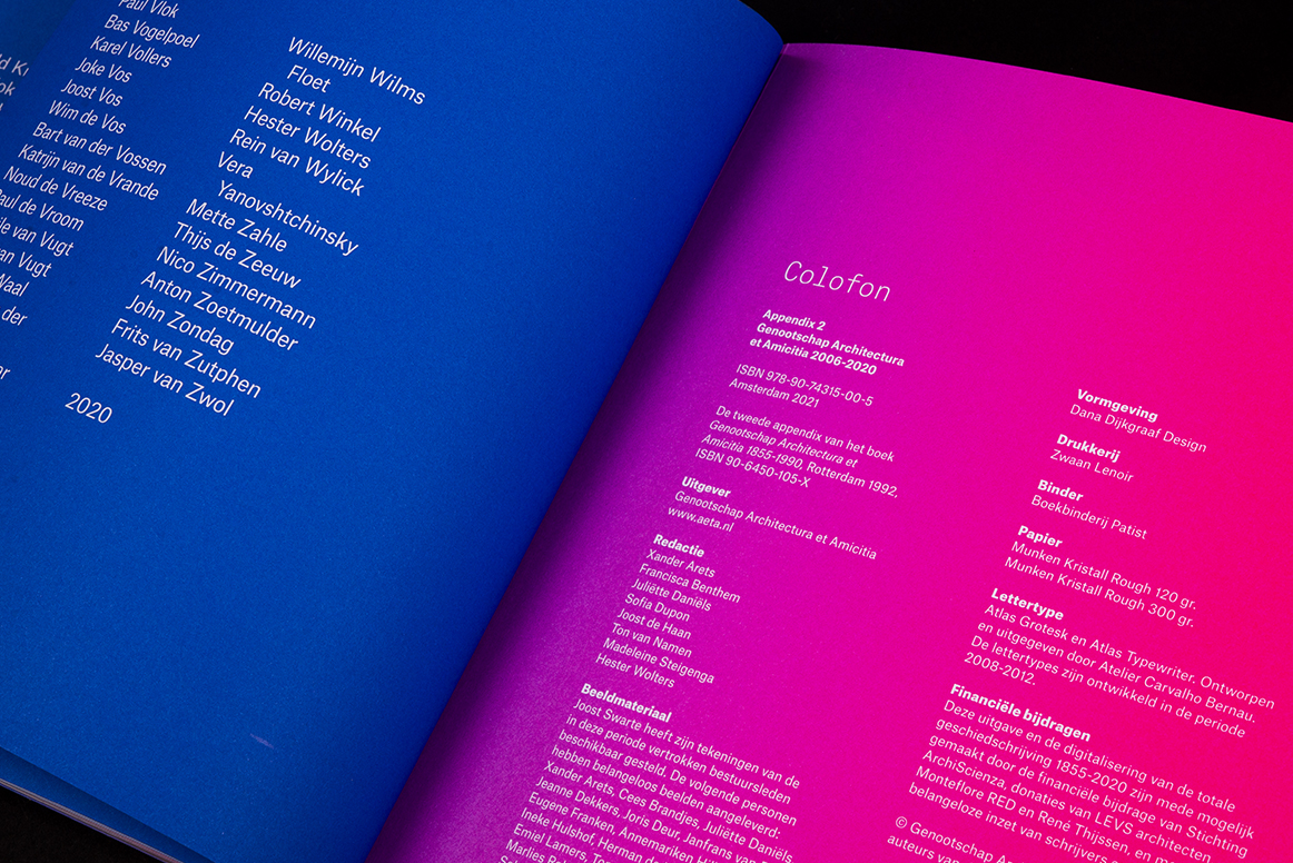
These various sections are compiled chronologically and divided into four parts. The book shows in words and design that architectural life has its highs and lows; from economic boom (2006-2007), to crisis and transformation (2008-2012), from recovery and new roles (2013-2019) to uncertainty because of Covid 19 and looking ahead (2020). These fluctuations are literally translated in the shape of the book, each with a distinct color, fading from a vibrant color in the center of the book to a subtle pastel color on the rest of the page.
What did we create?
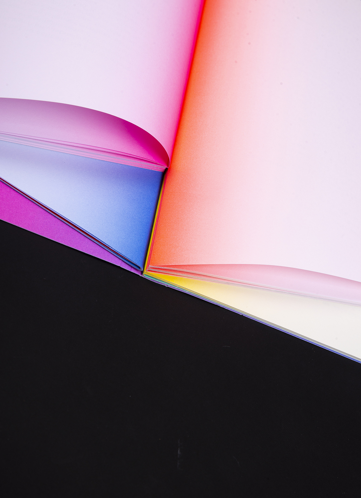
Just as an architect designs a building and architectural lines emerge in a landscape, the design of the book creates varying compositions of form and color. Besides fitting the story, the concept also fits the association – combining looking at and reflecting on architecture. As you flip through the book, a changing play of depth shapes, geometric planes and changing colors passes you by.
Sparkles
The book is printed in full color (CMYK) and 4 Pantone inks. Three of the five sections of the interior are cut at an angle, creating several exciting three-dimensional compositions of color and shape. The book is Swiss bound with Fluorine red yarn. Without the fantastic efforts of Bindery Patist and print shop Zwaan Lenoir, the making of this special production would not have been possible.