Hoofd- & Hartzaken
Head & Heart Matters is a practice for massage therapy, coaching and communication training. Founded on the philosophy that the heart and head are strongly connected in an infinite loop.
More info
Graphic Design
Dana Dijkgraaf Concept
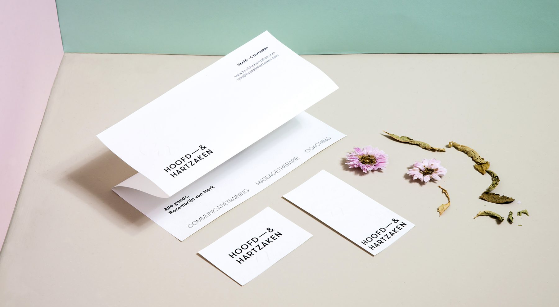
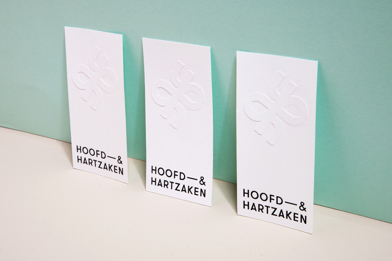
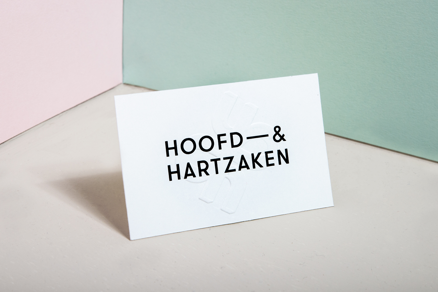
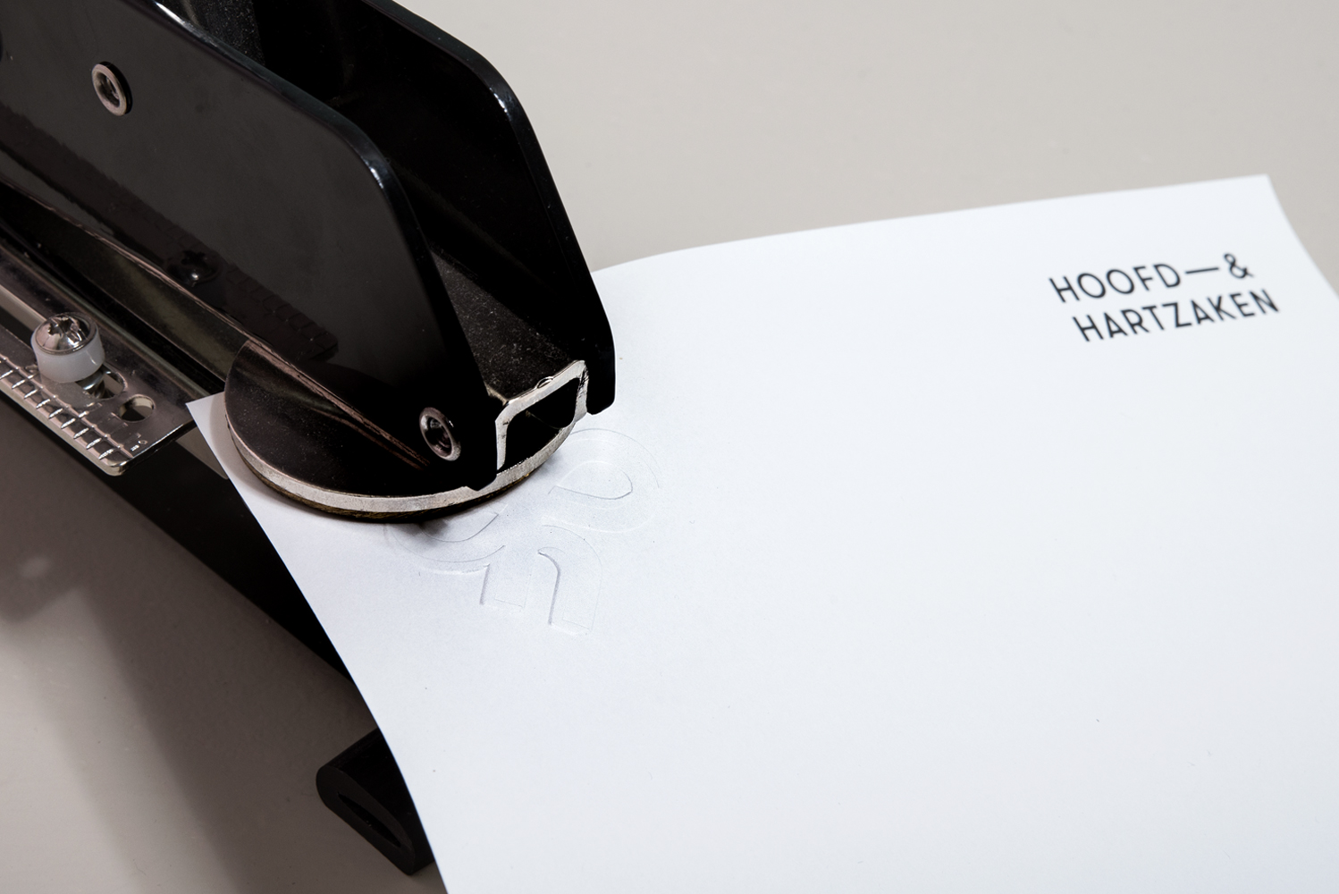
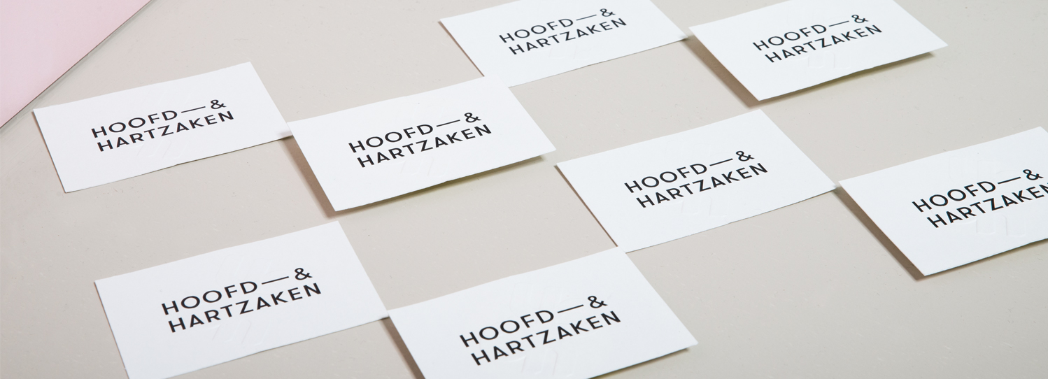
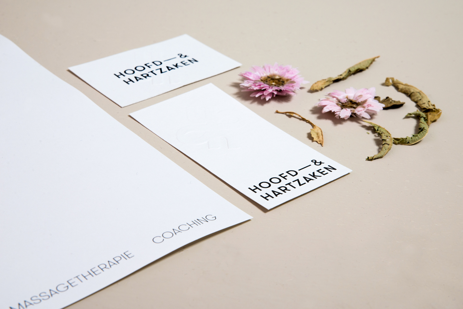
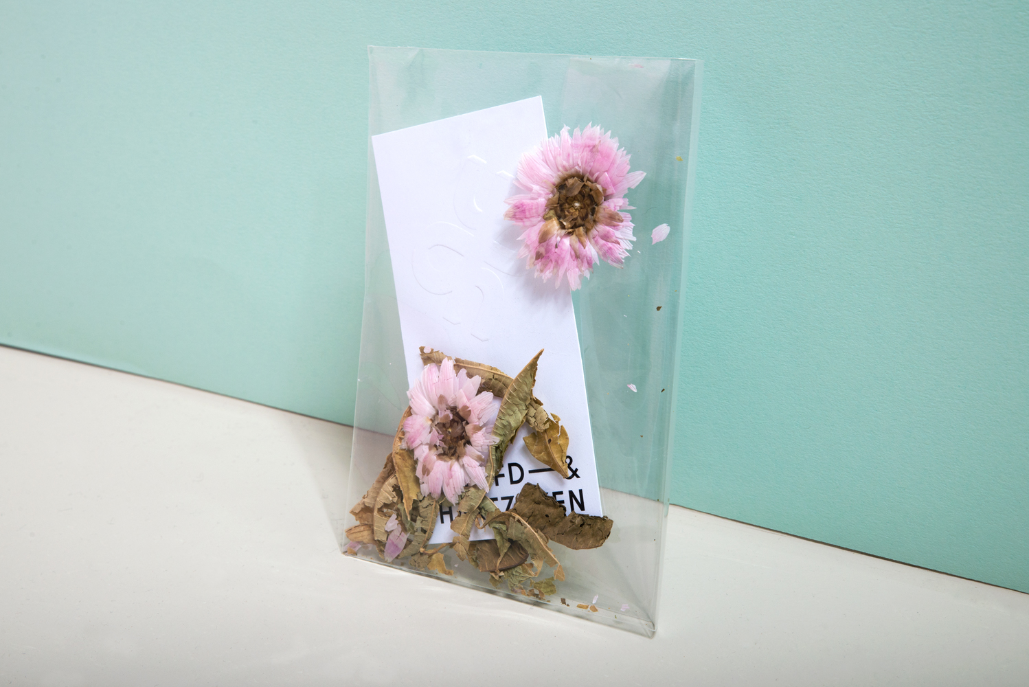
For the logo, we combined two H’s in which the connection is in the shape of a lemniscate (infinity symbol). It symbolizes the strong connection between body and mind, which is central to the vision of Head & Heart Matters. When people or companies seek help, it is often about problems that are happening under the surface. Head & Heart Matters helps by diving beneath this initial superficial layer. When used in physical items, the logo is embossed and applied three-dimensionally. When deployed digitally, the logo consists only of its shadow.
What I made
A logo and corporate identity design, business cards, stationery and a gift card.
Sparkles
The logo is embossed in every physical manifestation of the identity.
Less info