Jan Mankes
Concept
The exhibition explored the contrast between external chaos and inner calm, which is so characteristic of Mankes’ work. His paintings are known for their exceptional attention to detail, sensitivity to light, and deep connection to nature. These qualities formed the starting point for the exhibition design. By carefully balancing historical context with a contemporary visual language, the design aimed to create an atmosphere that encouraged visitors to slow down, observe closely, and fully experience the intimate scale and quiet intensity of Mankes’ paintings.
What we made
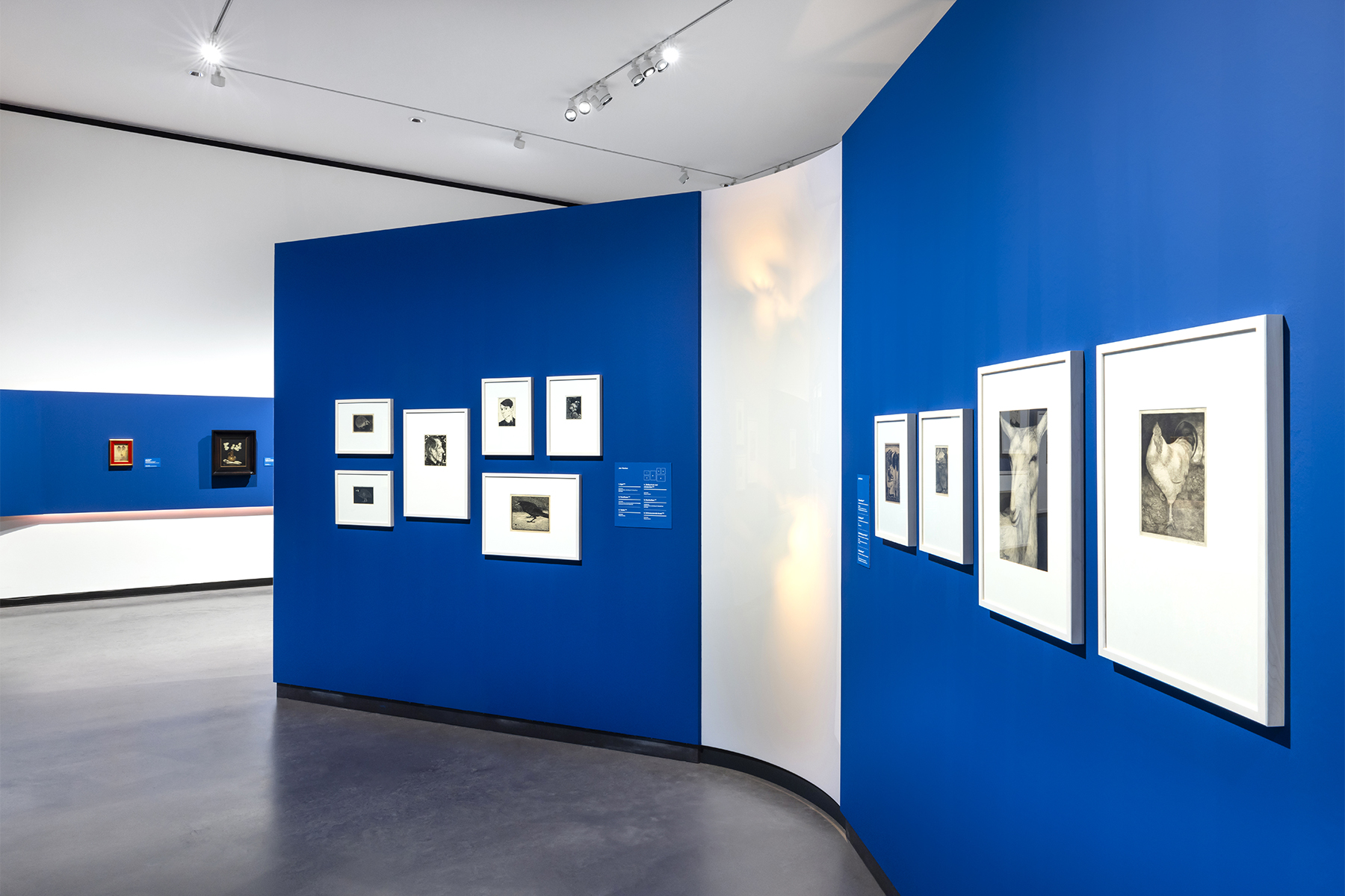
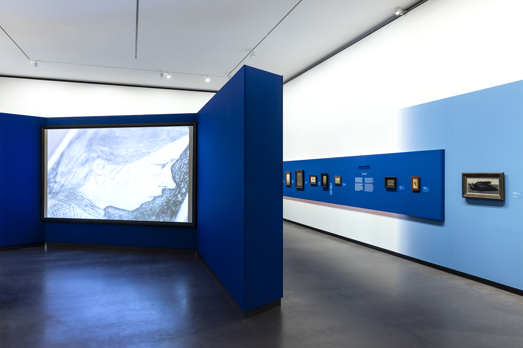
For the exhibition designers Studio met met, Jarle Veldman and Dana Dijkgraaf collaborated on a design built around two key visual elements: tones of blue and the use of shadows. In close cooperation with restorer Han Boersma, blue was selected as the primary color because it enhanced the visual strength and subtle tones of the artworks.
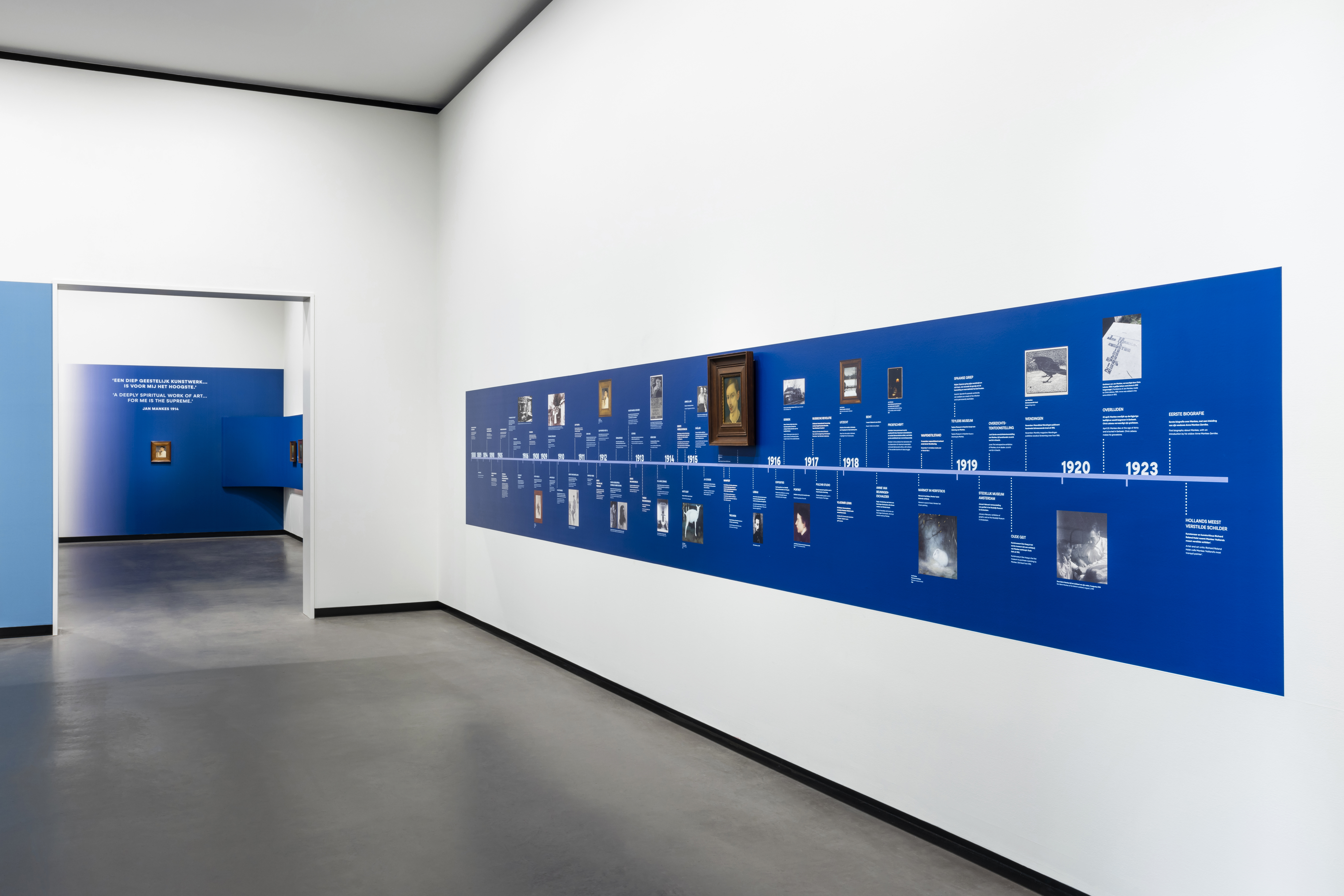
The exhibition presented Mankes’ works on a continuous deep blue band running along the walls, while contextual artworks by other artists were displayed against a lighter blue background. This contrast created a clear visual distinction while maintaining harmony throughout the exhibition. The blue framing helped visitors focus on Mankes’ intimate paintings, many of which are remarkably small in scale. The detailed painting of a kestrel, measuring only fifteen by fifteen centimeters, encouraged visitors to step closer and engage with the artwork in a more personal way.
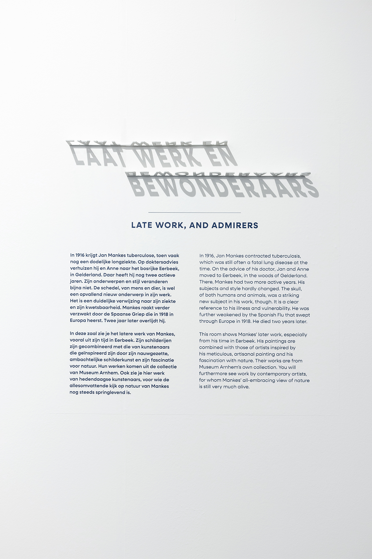
Where the different shades of blue met, soft gradients were introduced to create smooth transitions between Mankes’ work and the contextual pieces. Shadows played an important conceptual and visual role. Physical typography was designed to exist only through the presence of light, forming words through cast shadows. Additional subtle wall elements introduced soft plant shadows, reinforcing the connection between Mankes’ art and the natural world. A friendly and slightly curved typeface was chosen to echo the gentle and human character of Mankes’ work and personality.
Sparkles
Jan Mankes became an exhibition that quietly encouraged visitors to pause and reflect. Through the thoughtful use of color, light, and shadow, the design translated Mankes’ sensitivity and artistic vision into a spatial experience. The exhibition created a contemplative environment in which visitors could momentarily step away from the rush of daily life and rediscover the beauty of careful observation, stillness, and nature.