





Giselle Kuster – book
Concept
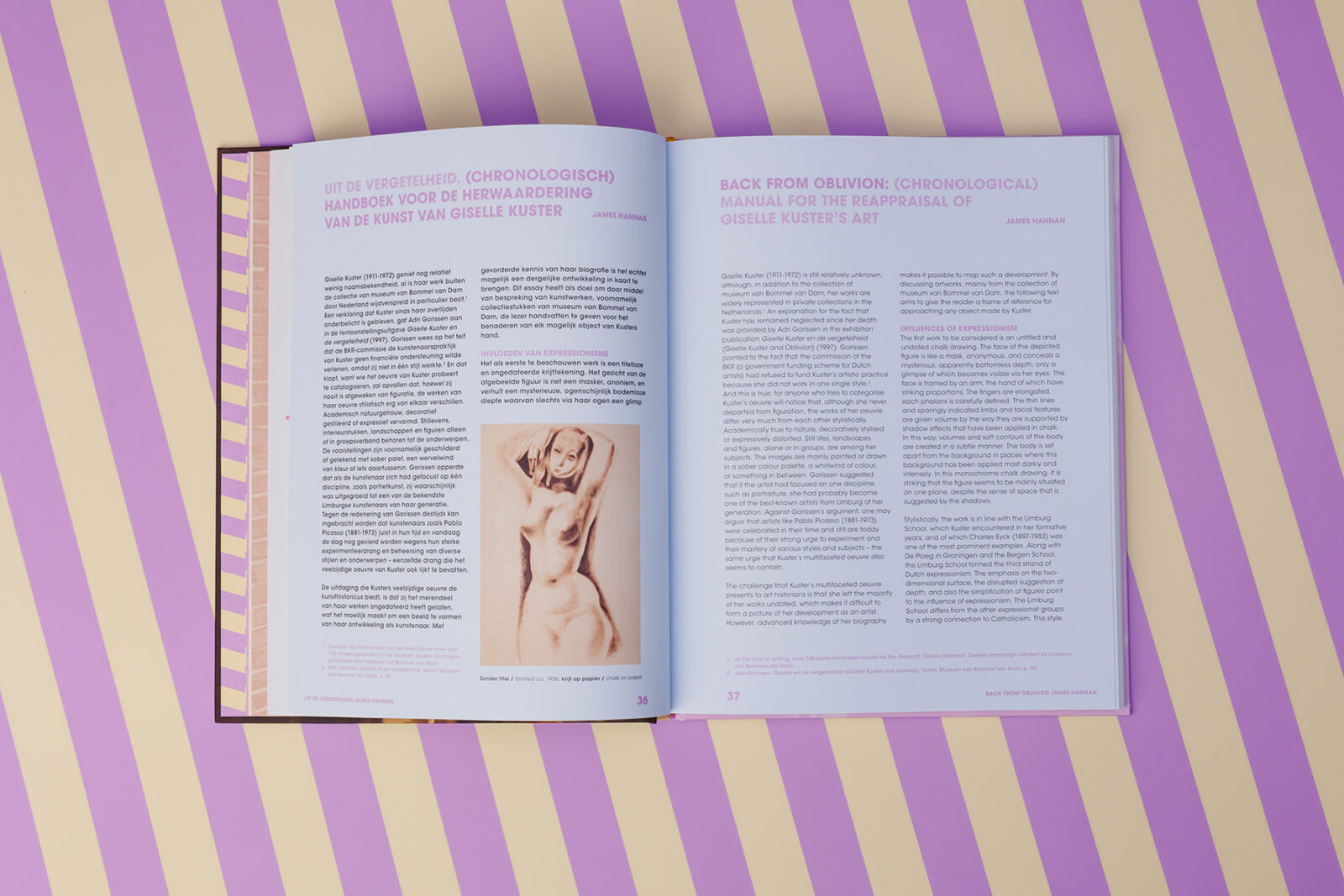
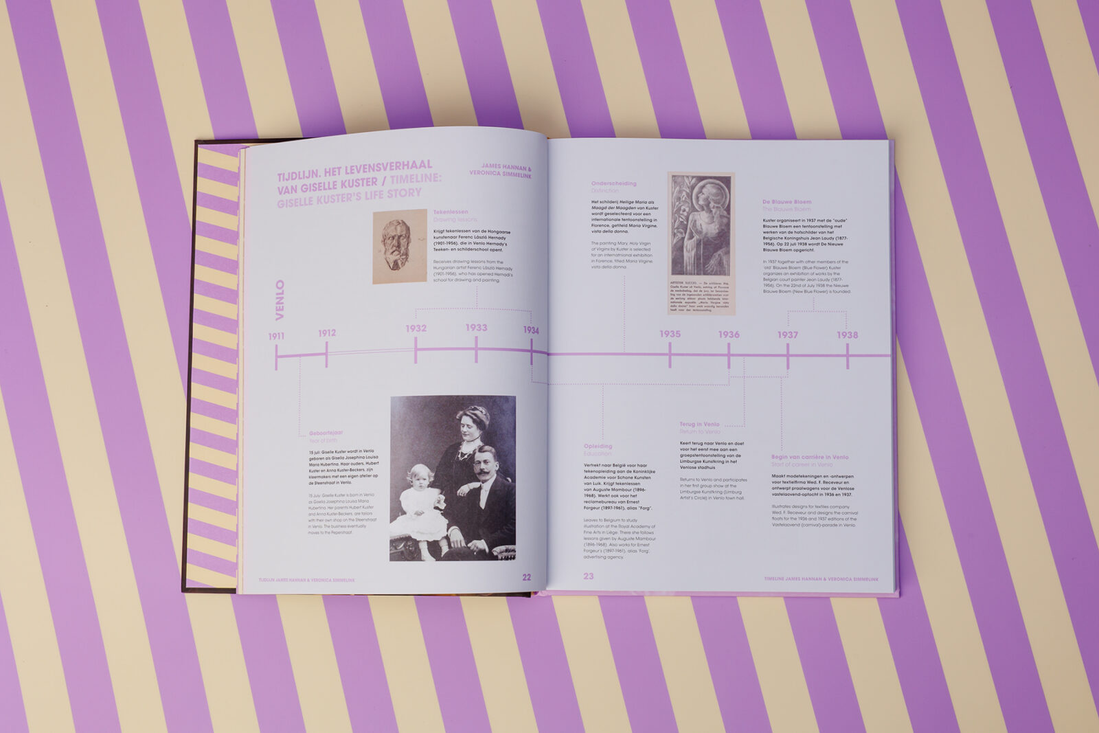
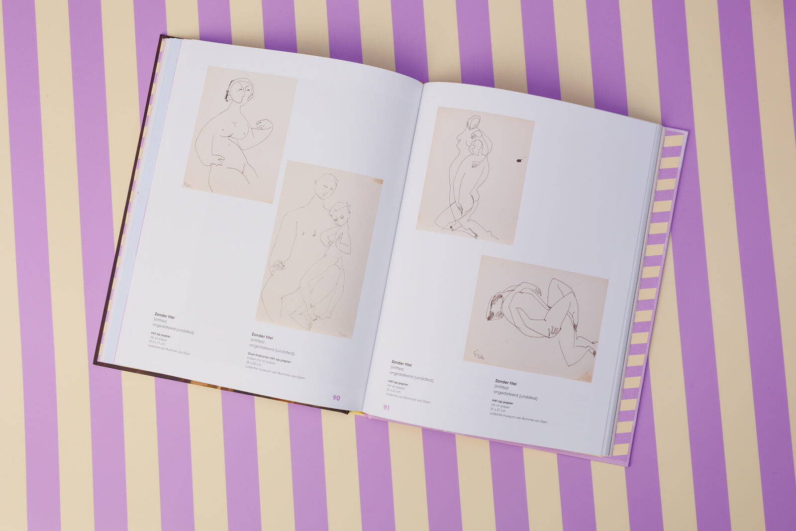
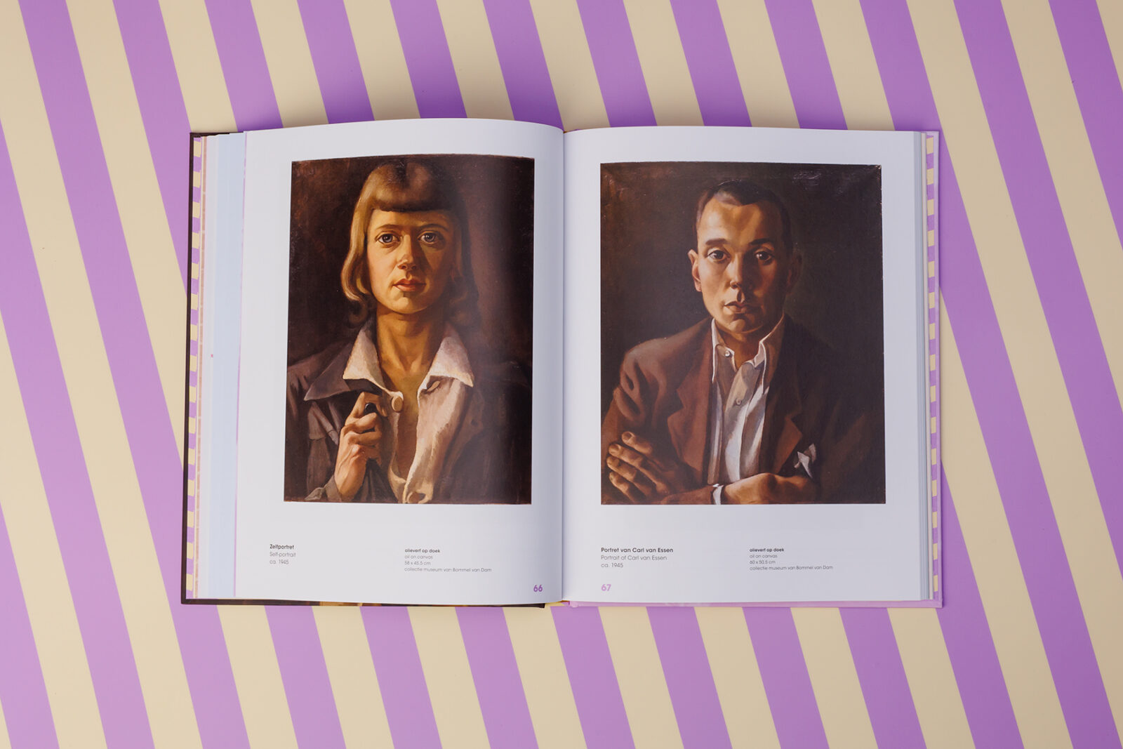
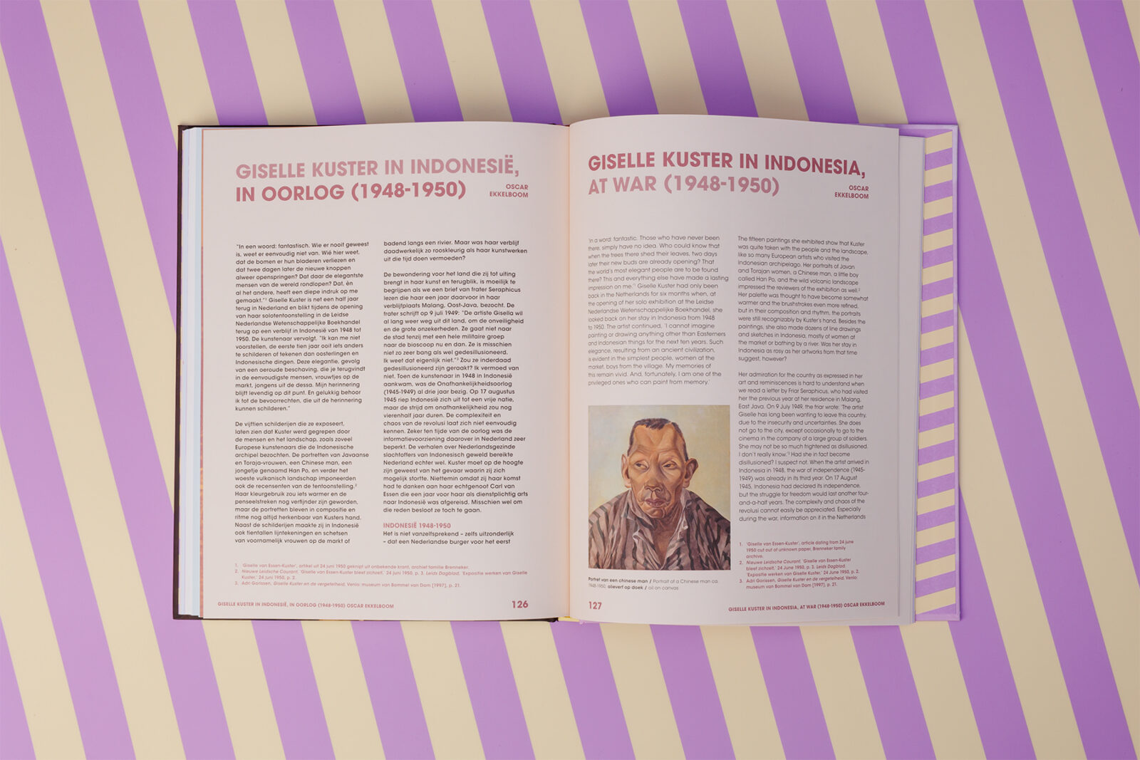
Giselle Kuster’s story unfolds through the places she called home. Every city, every landscape, and every new chapter shaped the way she looked at the world and, in turn, the way she painted it. Following the same chronological narrative as the exhibition, the book guides readers through these different periods of her life. Each chapter is given its own color palette, creating a visual journey that mirrors her artistic development while connecting the publication seamlessly to the exhibition.
What did we create?
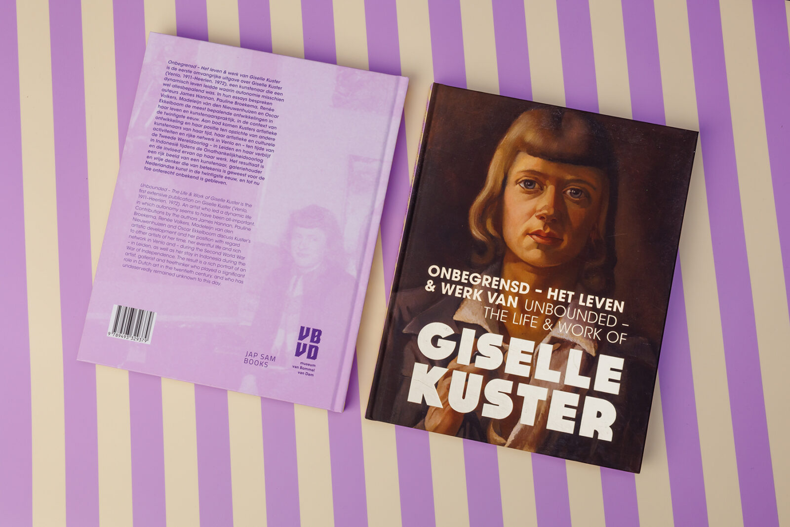
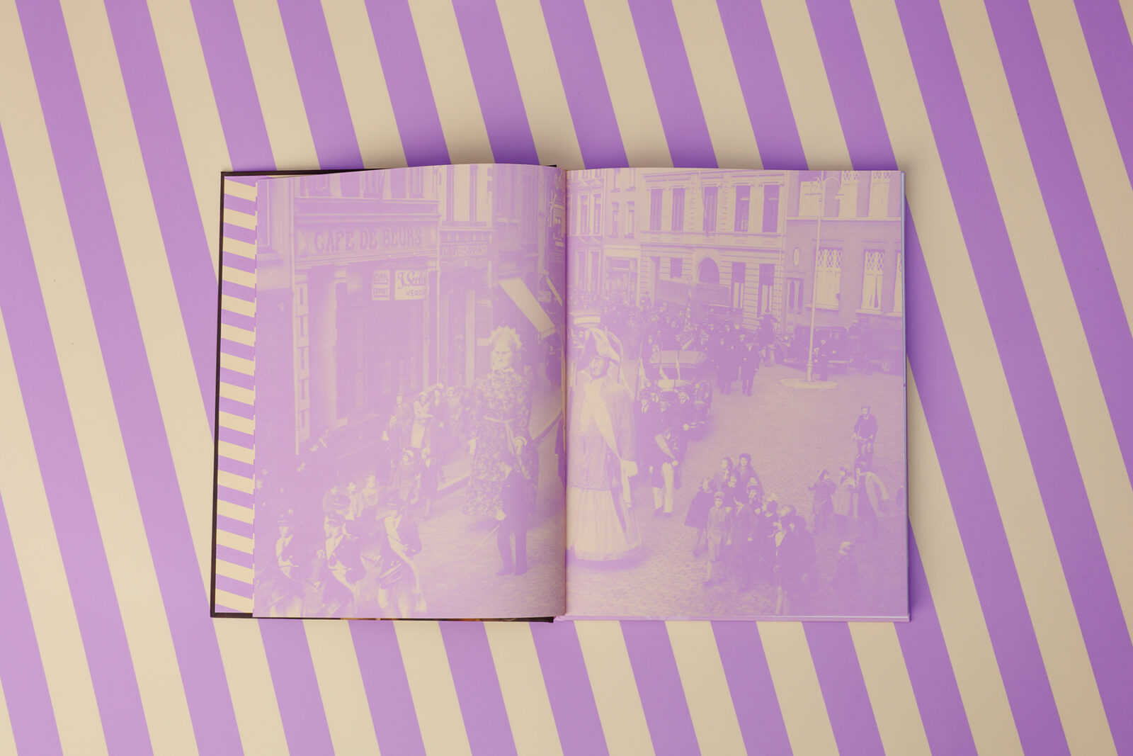
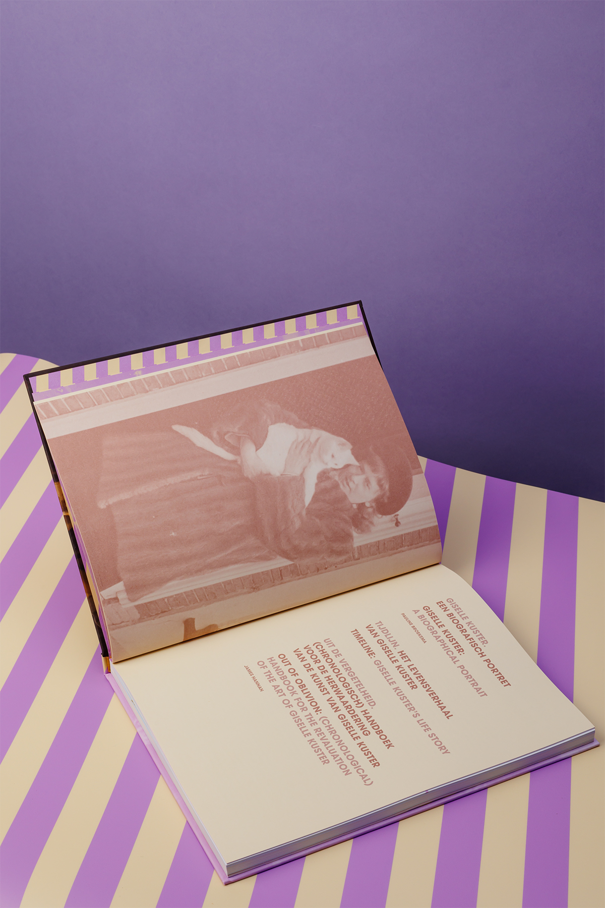
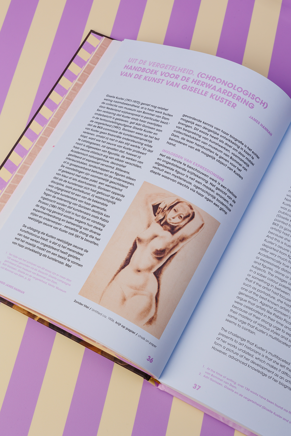
The design was conceived as an extension of the exhibition, allowing both experiences to strengthen one another while giving the book its own identity. Shifting colors mark the different places where Kuster lived, gently guiding readers through her artistic journey. Historical photographs, from intimate portraits to cityscapes and images taken by Kuster herself, are reproduced in vibrant duotones, adding rhythm and creating a dialogue between past and present.
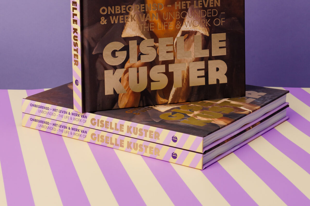
Typography became another storyteller within the book. Avant Garde was chosen for its connection to the experimental spirit of Kuster’s era, while a warm, rounded display typeface softens the composition and reflects her personality. On the cover, a striking gold foil title catches the light, symbolizing the renewed appreciation of an artist whose work shines as brightly today as it did during her lifetime.
Sparkles
The monumental self portrait that welcomes visitors to the exhibition, with Kuster wearing her distinctive purple and yellow striped skirt, became one of the key inspirations for the publication’s visual language. Together, the exhibition and the book tell one continuous story, inviting visitors and readers alike to rediscover an artist whose work has patiently waited for its moment to be seen again.